Sunday, October 17, 2010

The Black Duke - the Set (fini)

Thanks to a feature spot on Propnomicon, I got a bump in traffic today. So I figured this would be a good time to post the last of the pictures of the Black Duke project. These are just pictures that had more than one item in them, which I wanted to hold back since I was posting each item separately. Also, I have some glamor shots of the set as a whole. If you haven't already, click on the links at the end to see production shots and finish shots of each of the items in the set. I hope you enjoyed this project. I haven't heard anything about the production of the film since sending off the props, but it was scheduled to shoot in like April, so hopefully it is well underway. There has been no activity on the website (www.blackedgeproductions.com), so that may be a bad sign. Anyways, I wish them the best of luck with the project. Now, on with the last of the pictures-

As always, click through for larger images.


See also:
The Black Duke - the Diary (part 1)
The Black Duke - the Diary (part 2)
The Black Duke - the Box (part 1)
The Black Duke - the Box (part 2)
The Black Duke - the Box (part 3)
The Black Duke - the Tome (part 1)
The Black Duke - The Tome (part 2)

Thursday, October 14, 2010

The Black Duke - the Tome (part 2)

I haven't been in a blogging mood lately. Sorry about that. Anyways, on with the Black Duke Project...


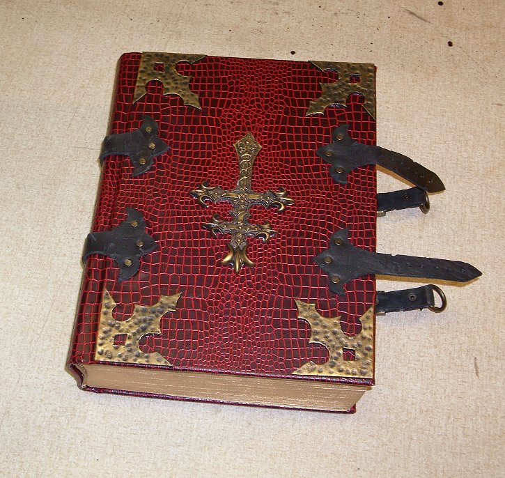
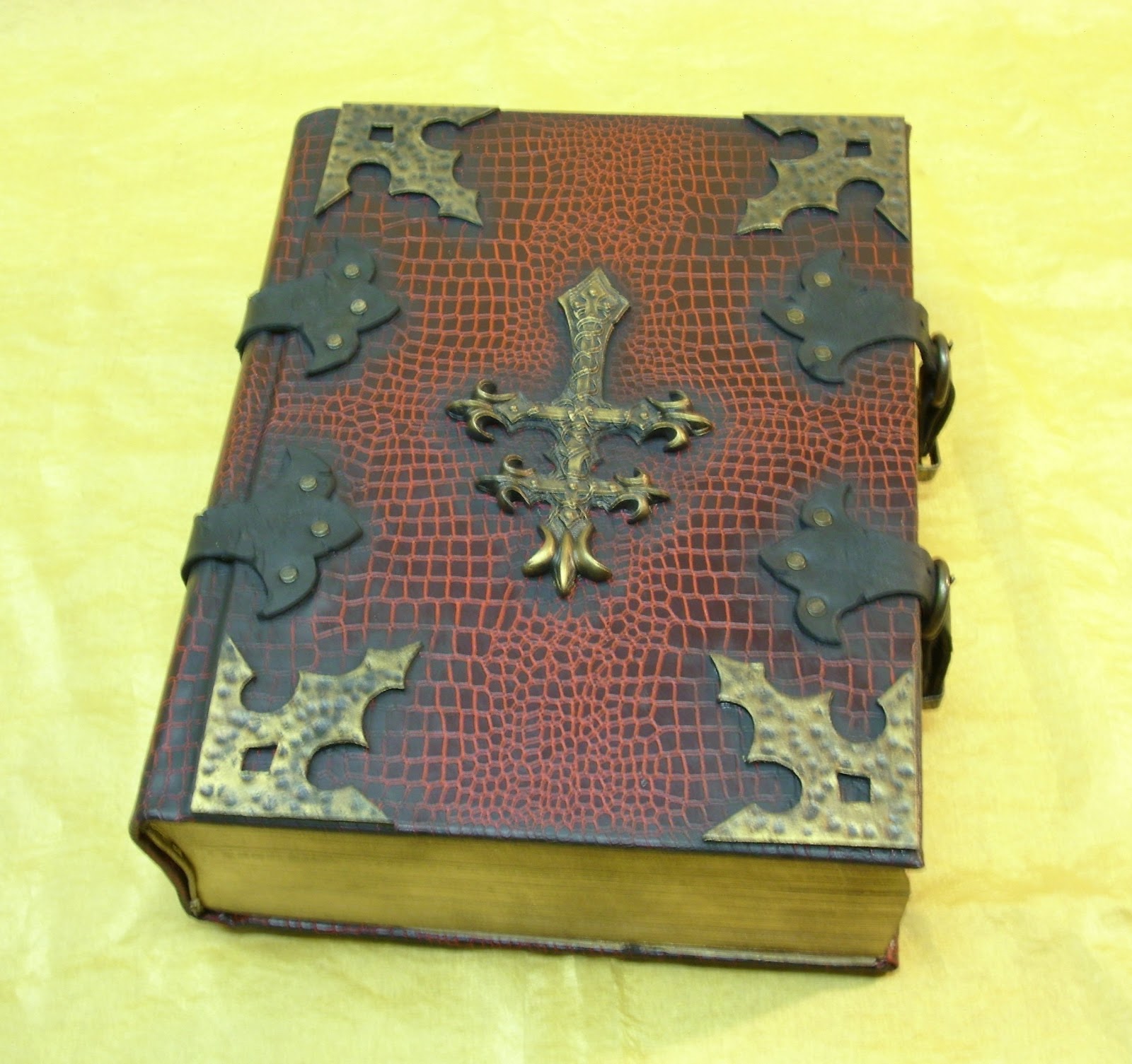
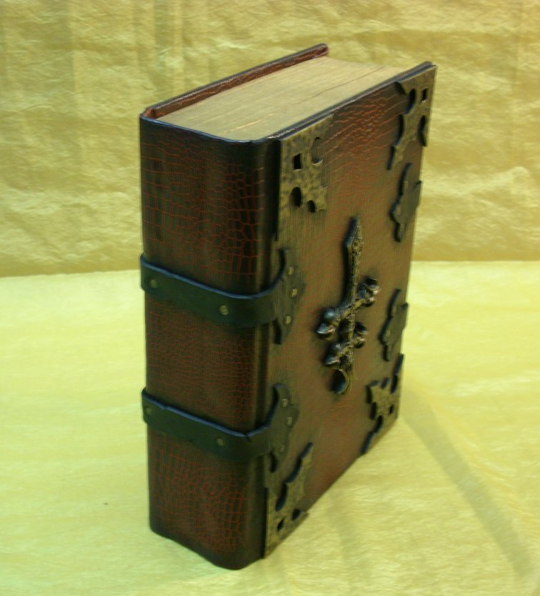
After securing the antiqued leather straps to the cover, I removed the masking tape place holders and glued the painted resin bosses and centerpiece in place. These were made the same way as my other projects, with cast resin finished with acrylic paint and some gold rub-n-buff.

Once all the cover attachments were in place and dry, I "cased in" the text block, meaning I glued the pages into the cover. In order to come anywhere close to matching the coloration of the natural pages, I had to custom paint the end papers. In addition to my usual coffee and tea dying treatment, I also used a foam roller and some "antique varnish" acrylic paint to add some "foxing" to the edges of the paper. The paper I started with had a very light lavender color to it. I don't remember now why I thought that would make a good base color to start with, but I remember thinking that it would.

This was the first time I had attempted anything like this technique, and I had mixed feelings about the results. I made extra sheets in case something went wrong during the paste up. I picked the two that matched the closest when it came time to use them. On their own, I don't think they look bad, but they didn't really match the natural aging on the rest of the dictionary's pages. However, they were convincing enough to use, and they matched the general color closely enough that if someone were flipping through the pages, there wouldn't be a terribly noticeable difference.

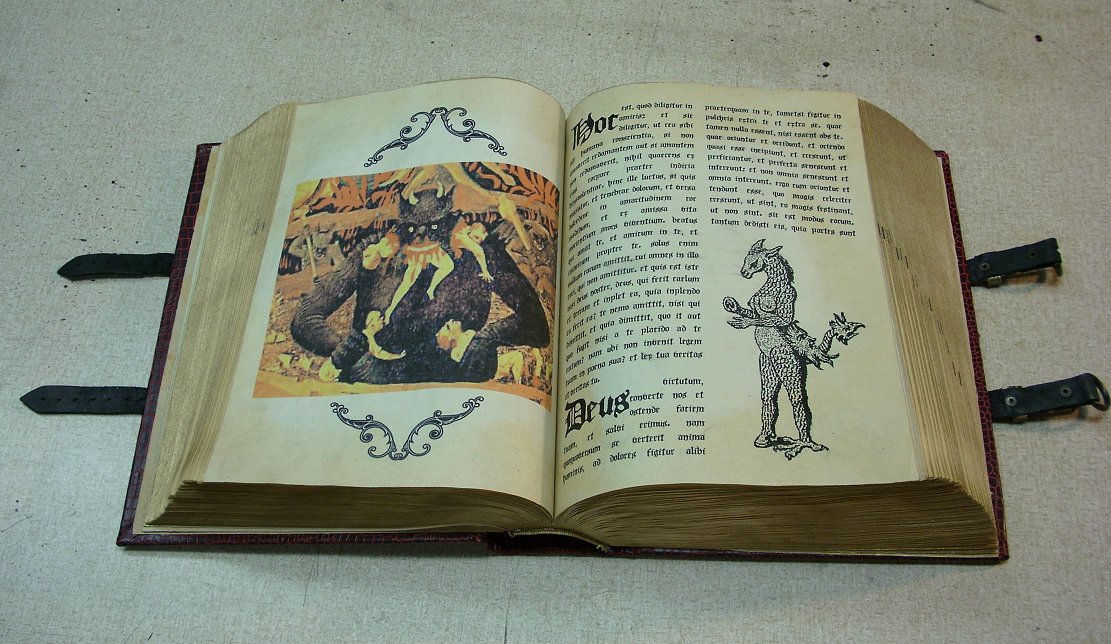
I used the same "antique varnish" paint to add foxing to the inserted pages as well, but with a much lighter hand. I laid out the interior pages in two columns, and used an Old English typeface font with justification. The text itself was lifted from latin liturgical texts (I have no idea what they say). A few pieces of line art were thrown in to break up the text. Their placement was strictly based on visual astetics. The line art was a mixture of actual medieval woodcuts, available on the internet, and drawings I had made for my Necronomicon Pages.

Additionally, there were several full color images that the clients wanted me to incorporate. I featured these as full page plates set aside from the text. The color images had to be printed after the aging of the paper because my printer does not have waterproof colored ink. As mentioned previously, these pages were "tipped in" to the existing text block by running a thin line of glue along the gutter edge, thus gluing it to the page in front of it.


With the interior custom pages tipped in, the text block cased in, and the cover embellishments all in place, the Tome was nearly finished. At this point it looked very much like many of the prop tomes I have made over the past few years. But this time I was going to try something different. This time I was going to add the finishing touch that would really sell this as an ancient tome of evil. Grime.


I started out subtlety, as this was the first time I had tried this and wasn't entirely sure how it would work. I used a black acrylic paint (which dries flat) and a dry brush and gently stabbed at the creases and crevices where I thought dirt and grime would accumulate. Also, I added the flat black to the edges and areas where I thought the object would get the most wear. In the pic above, you can just see the darkening around the edges of the leather straps and along the head and tail of the spine.

I continued this process around each side, applying grime around the edges of all the straps, bosses and the centerpiece, and also along the edges. I worked slowly, building up in layers, as actual grime would. I even took a towel and wiped off some of the paint I had added after each application. I wiped the cover as if I were cleaning it, to simulate how the large flat areas would not have as much grim build-up, because of normal handling and the occasional cleaning. I continued until I was satisfied that the book looked truly ancient and used. This simple thing might not seem like much to most people, but it represents a turning point in the realism of my prop work.

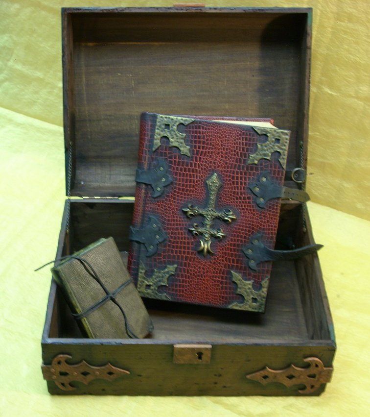
With the addition of the grime, the Tome was finished. So, here are about a zillion glamor shots of the finished piece. As you can probably tell, I was pretty proud of it.


I have one more final installment to this series of posts, which will include pictures of the set as a whole. If you are just tuning in, make sure you check out my previous posts of the other items in this set. The links are below.

See also:
The Black Duke - the Diary (part 1)
The Black Duke - the Diary (part 2)
The Black Duke - the Box (part 1)
The Black Duke - the Box (part 2)
The Black Duke - the Box (part 3)
The Black Duke - the Tome (part 1)
The Black Duke - the Set (fini)

Friday, October 1, 2010

Goatswood Recover

Sorry to break the flow of the Black Duke - Tome posts, but I wanted to get this up there to coincide with its ebay sale.

I just recently finished this exciting recover of the paperback Call of Cthulhu role playing supplement book, "Ramsey Campbell's- Goatswood, and less pleasant places", published by Chaosium.


The finished book measures 11.25" tall by 8.75" wide and 1" thick. the new hardcover was created with paper covered chipboard, in the usual manner. There is not much new in the way of construction technique for this project, so I didn't bother with any construction photos.


The finish is a mottled dark green and black with copper highlights. The most striking and unique features of this project are the front title plate and frame, and the rear goat's head silhouette applique. Both are of my own design. They were made from chipboard, and have been given the same antiqued copper finish. They were intended to look very old and dirty. The whole cover was made to have a sort of unhealthy antique appearance.


The tack heads that dot the appliques and which ring the edges of the book are much easier to see in the larger version of the photos (click through). They are real metal brads that were pushed through the cover and cut off at the back.


The title plate was printed on a special paper made from coffee leaf. It has a natural red blotchy parchment like color that did not require any dying or antiquing. I glued it to a piece of card stock to give it more body and then glued it to the back side of the frame.The bookmark is black cloth ribbon.


The inside front cover has a blank book plate (also known as an "ex libris" plate) for the owner to fill out at his discretion. This is the same book plate that I used in the Shadowmanor.com journals that I did not have pictures of, so just in case you were wondering what it looked like, here it is. The book plate was sort of an afterthought (it was a left over from the Shadowmanor journals) and I don't really think the coloration goes that well with the end papers I chose. Perhaps in future versions I will try something else.


This project was very hard for me to get off the ground. It sat dormant in the early stages of production for over a year because I just couldn't wrap my head around what I wanted to do, design wise. Even as I forced myself to move forward on this, I was very uncertain of the design. It wasn't until I came up with the title plate frame that things started to come together for me and I started getting excited about it. Now that it is finished, I am quite happy with it, and I think I might even do another one just like it (or very similar).


This item will be going up on ebay very shortly (perhaps even today). The original book, without modification, has a cover price of $28, so it will not be cheap, but I think it will be an excellent unique and usable display item for someone who is serious about his or her Call of Cthulhu books. I have a whole line of these recovered supplement books planned and which I hope to have finished in time for the holidays. I also have another three or four Cthulhu Cycle books that will be ready in about a week, so keep watching my ebay page if you are interested.


Update: I posted this item on ebay, and it sold within an hour. It is one of the top two fastest selling items I have ever listed. I never even got around to sending out a notice on my email list (I'm sick right now, so I took a nap). I did post about it on Yog-Sothoth.com.I don't normally list these kinds of items for international sale, as I hate dealing with international shipping. But this time I did. This book will be headed to England. I hope I charged enough for the shipping.