Continuing with the new sign for Book of Shadows project; we left off having added the copper foil trim to the background board...
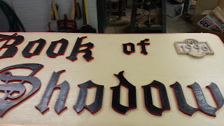
Now, having the letters painted and the background board painted and trimmed (and a coat of spar urethane), I was finally able to lay out the letters on the background board and see how it all looked.
Once I was happy with the positioning of the letters, I glued each one down with some waterproof wood glue, and I also tacked them down with crown staples using my air nailer. To make sure I kept the positioning correct, I first traced around each letter with a pencil to make sure I could get it positioned right back where it was after applying the glue to the back.
I touched up the staple heads with some more black paint, and then I applied several coats of spar urethane to the whole board, letters and all. I made sure to get heavy coverage where the letters met the background board, to try to seal the seam as best as I could. I don't want water getting behind the letters and rotting out the wood.
SON of a BITCH! Looking at these photos, I just realized something. The 'A' in Shadows, is backwards. Son. of. a. Bitch! Well, there's nothing that can be done about it now. That sucker is glued down tight. Trying to pry it up would likely destroy the entire sign. At least the letter is so stylized that it is hard to notice. Anyway, that's what I'll keep telling myself for the next ten years while I'm looking at this thing- and only seeing the stupid backwards 'A'. ...son-of-a-bitch.
I need a minute....
OK- Moving on. While I was busy not noticing the backwards letter, my eye kept being drawn to the negative space in the upper right corner of the sign. At first I liked it that way, but later I started thinking it needed something to balance it out. Since it was our 20th anniversary, I had been toying with the idea of incorporating something to commemorate the store's longevity somewhere on the building. I decided to try to make one of those plaques that say the year the business was established. I sized it to fit into the empty space in the upper right corner of the sign.
I made the plaque out of scraps of plywood. The design was off the cuff, but it came together well. For the lettering, I printed out at 1:1 scale on the computer and spray glued the printout right to a piece of plywood. Then I cut the letters out on the band saw. I used a piece of masking tape as a temporary "zero clearance" plate. A zero clearance plate makes the gap between the blade and the table very very small. This is especially helpful when cutting thin delicate pieces that could get caught and pulled down into the gap otherwise.
The lettering was glued down, and the paper was peeled off of them. Trim pieces were added around the perimeter of the plaque.
I set the plaque in place and played with the positioning to see if I was going to like it there. I still wasn't sure about it, but I figured I would finish the plaque and think about it some more. I could always hang the plaque somewhere else if I decided I didn't like it on the sign.
After the lettering and trim was glued in place, the whole plaque got a primer coat of black exterior paint.
The background was painted red, to tie in with the lettering on the rest of the sign. The lettering on the plaque and the trim were painted gold with metal leaf paint (hoping that it works out better than it did last time). I did my best to simulate the look of brass. I also added some small accent pieces to the sides, to give it more flair.
I pondered the inclusion and positioning of the plaque for a few more days, then finally I decided that I would go ahead and glue it down.
That's the main part of the sign. I could hang it just like it is, and it would be great. It would certainly be better than what is up there now. But I'm not quite done yet. Tune in next time, and we will get started on the accent pieces that will flank the main sign on either side.
See Also:
Book of Shadows Signage v3.0 (part 1)
Book of Shadows Signage v3.0 (part 3)
Book of Shadows Signage v3.0 (part 4)
.
Githyanki Silver Greatsword
-
I love seeing tabletop roleplaying items turned into physical props. This
massive Githyanki silver greatsword comes to us from Olympian props. I'd
clas...
15 hours ago


I can't even see something wrong with the "a" after you told it is the wrong way. So don't fret too much about it :-)
ReplyDeleteThe "est. 1996" ist a great addition - I like it !
Yeah, it could easily be missed. I must have looked at it like that for a week while I was building the thing and didn't notice until I was writing this post.
ReplyDeleteP.S. Got your package the other day, @Heribert Huber. Thank you very much. We'll have to see if I can do anything interesting with it.
Glad the package arrived :-)
ReplyDeleteSmall blanks like those don't look like much but there's a lot you can do with them. About 70% of my turnings I do with blanks of about this size.
Spinning tops, pendulums, pens, handles, awlhafts, needleboxes, earrings, pendants, handles for cutlery... stuff like that :-)