Friday, April 29, 2011

Steampunk Phonograph (pt.2)

In Part 1 of Steampunk Phonograph, I showed you the construction of the "wax cylinders". Now let's take a look at the construction of the phonograph horn.

I have never made something like this before, so my methodology was a bit of a stab in the dark. Luckily, my stab seemed to hit the mark. I started with a kids plastic cheerleader megaphone that I bought from the dollar store. Basically just a plastic cone of approximately the right shape and size for the base of the horn. It would of course need panels added to it to give it that trumpet shape we all recognize. I decided to try corrugated cardboard for the panels, because it is light, cheap and easy to cut and glue. I suppose I could have used cardboard for the entire horn, but when I saw the plastic megaphone, I thought it looked like it was something I could use, so that's what I started with. As it turns out, it was a a good move. The size pieces of cardboard I had to work with, added to the length of the megaphone made for the perfect length for the horn that I wanted.

I had only the vaguest idea how to go about this, so I started by making a paper template. I envisioned six or eight panels coming out of the plastic cone. I measured the circumference of the larger end of the cone and found it to be about 40cm. That divided by eight very well, so I planned on eight panels. I took a standard 8.5x11 piece of scrap paper and folded it in half to get a center line. Then I measured a 5cm segment that would fit to the cone and centered it on the center line. Then I just extended lines out to the far corners, giving me a trapezoid. I had no idea what shape I really needed, I was just figuring on a lot of trial and error.


I folded the lines instead of cutting them, figuring the fold would give it a bit more strength and stability for my test. I made eight of these paper panels and taped them together and had a look at them. It was actually not that bad.  And it fit on top of the cone just about perfectly. I could have actually gone with that, but I did think it needed a bit more shape.


I figured that if I angled the line inward a little, halfway along the length, that would add more curve to the horn, or at least another segment of flare. What I really needed was to bring it in a little on both sides with a gentle curve, but I had no idea how to get such a curve and make it consistent. I didn't have anything like a french curve template handy, so I thought I would start with just a straight angle and see how that went. I brought each side in by 1cm, halfway along the length.


I made seven more of these, and taped them together, completing my second paper test horn. I sat it on top of the cone and it fit and balanced perfectly. To get something so flimsy to balance so perfectly on my first try was kind of creepy. It's not taped to the cone in the pic, it's just sitting there, balanced perfectly on the edge.


The angle I had added to the paper panel was taking me in the right direction. The horn had a much more pleasing bell shape to it, though still somewhat angular. But I decided not to press my luck by trying to go for a better curve. Since I was going for a steampunk version of a phonograph, a somewhat stylize horn would be OK. This would do.

I moved to cutting the panels out of corrugated cardboard. First I cut out one of my paper panels and traced it onto a piece of chipboard to make a tracing template. I wanted to make sure all my panels were exactly the same. I was also careful to make sure that the ribbs in the cardboard were running the same direction for each panel.


After cutting out eight panels, I started taping the seams together with masking tape. In my first attempt, I scored the panels at the angle so they would bend nicely at that joint. That looked like crap. What I ended up doing was to bend the panels over the edge of the table, kind of like the way you curl a piece of ribbed ribbon with a pair of scissors. This gave the panels a nice gentle curve that looked exactly like I had envisioned. I wouldn't need a french curve after all. This was supposed to be just a test fit, but when it went together, it fit so nice, I just left them that way. The majority of the tape is along the seams on the underside (outer side) so you can't see it in the photos. 


I had originally planned to make the horn in two halves that could be fitted together on site. This would make transport and storage much easier, but that's not really working out so far.


Once I had all the panels taped together for the test fit, I sat it on top of the cone to see how it looked. Voilà!


I played around a while with several different designs to try to find a good way I could marry the cone to the panels in a non permanent way that could be done and undone easily on site, but without much luck. I ended up just gluing them together and covering the joint over with some papier-mâché. Then I coated it all in Mod Podge for a sealer and then a base coat of flat black spray paint.


It's hard to get much of a sense of scale from the pictures. The wide end of each of the panels is 8.5" long, making the circumference of the large end of the horn about 68", which would make the wide end about 22" in diameter.


See Also:
Steampunk Phonograph (pt. 1)
Steampunk Phonograph (pt. 3)
Steampunk Phonograph (pt. 4)
Phonograph Prop Redux

Saturday, April 23, 2011

James A. Leach, R.I.P.

This past week, my shop clerk (now retired) suffered the loss of her ex-husband, Jim. James A. Leach passed away in the hospital last week while being treated for pneumonia. Though they were more than twenty years divorced, Jim had been living with Toni and helping her care for her aging mother for the past few years.


In preparation for the memorial service, she and her daughter, both of whom I have known since I was in the second grade, asked if I would help them put together a framed photograph of Jim. They presented me with a very old, very damaged, wallet sized black and white high school senior picture. I had a limited amount of time before the service, and even more limited photoshop skills to draw upon, but I was thankfully able to enlarge the photo to 8x10 and make sufficient repairs as to make it presentable. Above is the retouched photo that was used for the memorial service (reduced in size for bandwidth purposes). Below is the original.


As there would be no viewing of the deceased (the remains were cremated) this photo was the centerpiece of the service. I don't do a lot of photoshopping, but I think it came out fairly descent.

Rest in peace, Jim. You will be remembered.

Thursday, April 21, 2011

Steampunk Phonograph (pt.1)

At this year's Origins Game Fair (June 22-26, 2011) I am running a lovecraftian Live Action Role Playing game based on one I ran last year called "The Space Between". Last year's LARP was basically the prequel to the movie "Event Horizon". The maiden voyage of an experimental spaceship that can travel across the galaxy by punching a hole through space and entering another dimension. This year's LARP, called "Æthernauts", is a reboot of that story, but reworked in a Victorian steampunk setting. To that end, I have a whole slate of steampunk props that I am working on for the game. I don't want to give away any spoilers about the game, but I do want to share the props with you. They are all works in progress at the moment, so I will be posting their construction piecemeal.

This is the first item for Æthernauts that I started on. It is going to be a steampunk phonograph. It was originally just going to be a prop of a regular phonograph, but during the brainstorming, I had the idea to replace the needle with a laser pointer, kind of making it a Victorian CD player.

Using a disk rather than a cylinder would have been much easier. I could have just bought any old vinyl record and made a new label. But I have never been one to take the easy road. I preferred a cylinder, so that's where I started. I had an idea of what might look good, but it was untested, so I had no idea how it would turn out.

I'm on a very tight budget for this project, so the cylinders have their inglorious origins in my bathroom waste bin. These toilet paper rolls needed a little reinforcement, and a way to hide the tell tale spiral seam that makes them look like, well... toilet paper rolls. So I wrapped them in some office paper trimmed to size and coated in glue. Then I gave them a base coat of black spray paint.


Next came the grooves. Making grooves or indentations into the rolls would have been hard, but creating raised ridges is quite easy. A little Mod Podge, a healthy length of black crochet thread, and a lot of patience. It's important to make sure that the windings are evenly spaced and have no crossed windings. 


Once the Mod Podge was dry, I gave it another shot of gloss black spray paint. The raised thread looked a little wrong, but luckily I had an idea how I could make it right. I made a strip of paper the width of the space with no windings, and wrapped and glued it to each end of the cylinder. This raised the surface of the cylinder to match the height of the windings, making the grooves below the surface, just like they should be. Another shot of gloss black and viola! (yes, I know. it's a thing)


Being pleased with the results I set about gilding the lily. A custom made cylinder box seemed the thing to do. I based the design on the old player piano scroll boxes we used to have when I was a kid. Antiques even back then. I had never made a box with a fitted lid from scratch, and I was a little concerned that the tolerances would be too tight for me to pull off (exact measurements have never been my strongest suit), but it didn't turn out too bad.


I plan to make some printed paper labels for the boxes, but I haven't designed them yet. I did do a little recon to see what actual cylinder packaging of the period looked like, but I actually don't like it, and it's the wrong shape, so I think I'll make some labels reminiscent of the ones on those old piano scrolls.


It might be worth mentioning that before looking up the packaging designs on wikipedia, (which was after I made the prop cylinders) I had never seen an actual wax phonograph cylinder. Of course I had a vague idea what they should look like, but I had never seen a close up picture. They are a lot thicker that I thought. Anyway, I guess most of my players probably haven't seen one up close either. Here's to hoping.


Next up will be work on the body of the phonograph and the speaker horn. I have selected a prefab box to use as the body. I'm going with the rectangular one, on the right. I like the baroque scroll work on the lid. It will serve as a nice speaker grill for the real speakers that will be hidden inside.


More on that later.

See Also:
Steampunk Phonograph (pt. 2)
Steampunk Phonograph (pt. 3)
Steampunk Phonograph (pt. 4)
Phonograph Prop Redux

Friday, April 15, 2011

Doctor Glamour - De Vermis Mysteriis

About two months ago, I received an email from someone who saw the tome I made for "The Black Duke" film project and was interested in having me make something for him. Later he told me it was for a film project of his own, and he wanted me to create two prop tomes; a "De Vermis Mysteriis" and a "Necronomicon". Filming was to begin in mid April, so he needed an answer right away. I received this request with the usual reluctance, but I needed the money, so I agreed.

The upcoming film is called "Doctor Glamour". It's kind of a campy lovecraftian themed oddity set in a steampunk alternate Arkham. Oh, and did I mention, it's a musical! The client, independent film director Andrew Jones, didn't give me much in the way of requirements or specific direction. In fact, about the only specific direction he gave me was to avoid the color green, as the film was going to be shot in front of a green-screen. But he did send me links to his production blog and to the film script. There was enough detail there for me to get a good idea what he was looking for.

As with most commission jobs, time was short, and as usual, I spent too much of it wrapping my head around the project, waiting for design ideas to "click". Once they did, I had to put in some very long nights to make the deadline.

The first tome I worked on was the De Vermis Mysteriis. The first step, after doing a bit of brainstorming, was to select a base book of the appropriate size. I had intended on using a larger book than I ended up using, but because I wanted there to be a significant size difference between the two tomes and I was having trouble finding a base book for the Necronomicon that was as big as I wanted, I settled on an average sized "New Standard Encyclopedia" (volume "B"). I removed the text block from the case and cleaned up the glue in the usual way. Then I sanded the boards a bit so that the new covering material would adhere better.


I knew that I wanted to have the tile in raised letters on the cover for this one, but I wasn't sure exactly how I was going to accomplish that. I had thought I would cut the design out of chipboard and glue it to the cover and then use my crumpled paper technique over it. But even after selecting a font with minimal serif, cutting it out of chipboard was going to be far too difficult. I decided to try an experiment. I printed the title out to full scale and laid it over a rolled out piece of Sculpy.


At first I started cutting through the paper and Sculpy with an Xacto knife, but that was still too difficult, especially around the tight corners. So I lifted a technique from Michelangelo, and poked tiny holes through the paper with a straight pin, following along the edges of the design. The holes created dimples in the Sculpy that were visible enough to follow after the paper was removed. I then followed the outline of holes and cut out the letters with the Xacto knife, very carefully.


This technique worked better than I had anticipated. Cutting the letters out of Sculpy was far faster and easier than I thought it would be, and WAY easier than cutting them from chipboard would have been. I also got a much cleaner edge. I had been smart enough to lay the sheet of Sculpy on a thin metal sheet that I could put directly in the oven without having to move the letters.


After the letters were baked,  I glued them to a piece of hardboard and gave them a coat of sealer. The I created an RTV silicone rubber mold of them. I could have used the Sculpy originals on the tome, but I was afraid I might screw something up, and have to cut them out all over again. This way I could make a resin copy of the letters and re-cast them as many times as I needed. The resin casting actually came out very nice and in one piece, with a very very thin membrane of plastic holding all the letters together. This would normally be considered "flash" and be trimmed off, but in this case it was actually helpful in keeping the letters aligned.


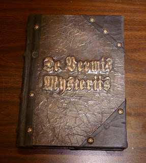
I glued the resin title to the front cover board, flash and all, and used the crumpled kraft paper over it and also the back cover board. Then the paper was given a base coat of black acrylic paint, which was followed up with a sponged on stippling of dark brown, and finally dry brushed with a light golden brown acrylic paint. I had never used brown paint for this technique before, and I have to say the resemblance to leather was uncanny.


After turning in the edges, I stuck the book-block back in for a test fit to make sure everything was hunky-dory. Also, this gave me an opportunity to set the groove with my bone folder.


I added a strip of chipboard to the spine to strengthen and stiffen it. I also glued on pieces of cut heavy cord to simulate raised cords on the finished spine, which would soon be covered in soft black leather.


I got the leather that I used for the spine and corners from cutting up an old leather jacket that I bought from a thrift store.


The last step before antiquing was to add brass upholstery tacks along the edges of the leather. I actually liked the look of the book so much at this point that I considered not doing any more antiquing to it. I think I may make some more books in this same design.


But the antiquing must go on, so I pulled out a couple of the upholstery tacks and painted around the edges of some of them (including the empty spaces where tacks were removed) with some green faux patina paint. I also used a dry brush with brown and black around the edges and on the leather itself for some aging and grime. I made a few small slits in the leather with an Xacto knife and lightly sanded it in places. Then I took a mini butane torch to some areas, especially the slits, which the heat opened up wider and made look older and more natural.


The final step in preparing the cover, was to apply some gold Rub-N-Buff to the raised letters on the cover.


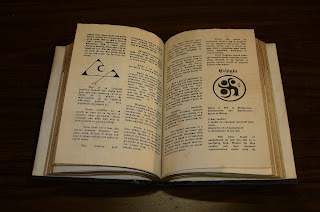
All that was left to do was to deal with the text block. I hadn't originally planned to, but I ended up giving the page edges a light shot of gold paint to simulate old worn gilding. The tome was going to be open on screen, so it needed to have some custom interior pages. The client only wanted two custom pages, but I ended up giving him four, so that he had the option of turning a page on camera. The custom pages feature a few of my pieces of line art that I  made for my Necronomicon Pages. The text is actually spells taken from our public book of shadows here at the shop and laid out in a nice Old German font similar to the title. I aged and trimmed these pages and tipped them in to the center of the text block.


The last step, of course, was to case in the text block.
And here it is. De Vermis Mysteriis, all ready for its big screen debut!


... Tune in next time for pictures from the making of the Necronomicon.

See Also:

Doctor Glamour - The Necronomicon (pt. 1)
Doctor Glamour - The Necronomicon (pt. 2) 
Doctor Glamour - The Necronomicon (pt. 3)  
Doctor Glamour (fini)

Sunday, April 10, 2011

Adam Freaking Savage

Last week I sold a set of Necronomicon pages on my Etsy site, which in and of itself isn't too unusual. But the thing that made this particular sale stand out was the name on the paypal receipt. Adam Freaking Savage!

Not to gush like a fanboy, but I'm a big admirer of his work, both on and off the show. He's where I wish I could be. Not the blowing shit up thing (though I may, or may not, have done a fair bit of that in the past, but without the cameras, or witnesses), but the professional prop maker thing. His attention to detail (obsession, really) is amazing. Just the idea that he would find something of mine worth buying, even as a passing novelty, is pretty ego boosting. Plus,..

Adam Freaking Savage!