Pages

Monday, November 29, 2010

Have You Seen the Yellow Sign?

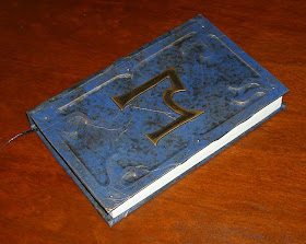
Hot off the work bench, here is my latest Cthulhu Cycle re-cover effort. This is a copy of Robert W. Chambers', The Yellow Sign and Other Stories, published by Chaosium as part of the Cthulhu Cycle series of short horror fiction books. It was made using the same techniques and in the same style as the other Cthulhu Cycle books I have recovered (which you can also find on this blog, in case you're a new visitor). It has a custom hard cover made with the crumpled paper technique and features the customary tentacle motif frame with brass tack heads, and a central glyph on the front cover. This time the glyph is my own interpretation of the Yellow Sign, which is based on a drawing by Jason VanMeter, which was probably inspired by the well known design by Kevin Ross.The sketch by VanMeter is one of my favorite Mythos images. It was just a simple doodle he made on the outside of an envelope that he had mailed from Japan to a mutual friend. The background was manila and it had several postmarks over top of it. I liked the image so much that I scanned it and spent hours doing color separations and clean up in photoshop (with my admittedly limited skills) to try to liberate the image from from its original media.

Click for larger images
The color scheme on this volume is different than any of the others I have done so far. It was done in mottled white and ivory acrylic paint over a yellow background and highlighted in gold. I also went with a gloss topcoat on this one, whereas I usually use a matte topcoat with this painting and finishing style. But I thought the gloss looked better with this color scheme. The glyph is done, as usual, in black with gold highlights. The book has yellow end papers and a black satin ribbon bookmark.


Because I was going with a lighter color scheme on this one, I used white butcher paper instead of brown kraft paper for the covering material. It seemed to work fine. In fact there was little difference to the way the two behaved. If anything, I thought the butcher paper was a little more manageable.


The tentacle motif frame around the front and back covers got an update with this edition too. The design I had been using  was very difficult to cut out with a razor knife due to its tight curves. I re-drew the border with slightly larger tentacles that had more gentle curves and fewer tight corners, so that it would be easier to cut. Otherwise, it looks very similar and you probably wouldn't have noticed the change if I hadn't pointed it out.


Saturday, November 20, 2010

New Domain Name

Old followers may have noticed that I recently added a title logo for this blog. I'm trying to spruce things up a bit. I also recently purchased the www.mrxdesigns.com domain name and a beefy hosting package (it was on sale). Right now it just redirects to this blog, but who knows, maybe soon I will add some other features and even set up a gallery or shopping cart on my site!

Upsetting News

I got an upsetting email the other day from the folks over at Shadowmanor.com, where I sold some custom covered blank journals last year. It seems they have had a complaint from one of their customers who purchased one of the books I made. It looks like the binding is experiencing some issues. Reading their understandably unhappy email, and seeing the (albeit fuzzy) pictures of the damage was very distressing to me. I am currently working with Shadowmanor.com to rectify the situation the best way I can. I have offered to fix any construction or materials issues that may exist for this, and any other of the books I made for them, at no charge. I'll even ship them back at my own expense.

Hopefully this is an isolated incident, but if you purchased one of my books from Shadowmanor.com and it is experiencing any construction or materials issues (short of abuse), please email me. You can send me your book and I will do whatever I can to fix the problem.

More Cthulhu Cycle Re-Covers

Hello all. It's been a while since my last post. I have started a new job, so I haven't been in the workshop as much. Plus, I just haven't felt like blogging lately. Oddly though, my traffic hasn't completely fallen off, and I've even picked up three new followers since my last post, about a month ago.

Here are some pics of my latest books to sell on eBay. They are all Cthulhu Cycle books published by Chaosium. They are all done in the same style as my previous Cthulhu Cycle re-covers.
First up: "Arkham Tales".


Next, "The Book of Eibon".


And third, "The Terror".


Each of these sold to the same guy on eBay. He is also interested in my re-cover of "The Yellow Sign", which is almost finished. He's going to have a lot of good reading to cozy up to the fire with this holiday season!

Sunday, October 17, 2010

The Black Duke - the Set (fini)

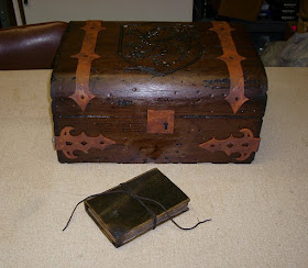
Thanks to a feature spot on Propnomicon, I got a bump in traffic today. So I figured this would be a good time to post the last of the pictures of the Black Duke project. These are just pictures that had more than one item in them, which I wanted to hold back since I was posting each item separately. Also, I have some glamor shots of the set as a whole. If you haven't already, click on the links at the end to see production shots and finish shots of each of the items in the set. I hope you enjoyed this project. I haven't heard anything about the production of the film since sending off the props, but it was scheduled to shoot in like April, so hopefully it is well underway. There has been no activity on the website (www.blackedgeproductions.com), so that may be a bad sign. Anyways, I wish them the best of luck with the project. Now, on with the last of the pictures-

As always, click through for larger images.


See also:
The Black Duke - the Diary (part 1)
The Black Duke - the Diary (part 2)
The Black Duke - the Box (part 1)
The Black Duke - the Box (part 2)
The Black Duke - the Box (part 3)
The Black Duke - the Tome (part 1)
The Black Duke - The Tome (part 2)

Thursday, October 14, 2010

The Black Duke - the Tome (part 2)

I haven't been in a blogging mood lately. Sorry about that. Anyways, on with the Black Duke Project...


After securing the antiqued leather straps to the cover, I removed the masking tape place holders and glued the painted resin bosses and centerpiece in place. These were made the same way as my other projects, with cast resin finished with acrylic paint and some gold rub-n-buff.

Once all the cover attachments were in place and dry, I "cased in" the text block, meaning I glued the pages into the cover. In order to come anywhere close to matching the coloration of the natural pages, I had to custom paint the end papers. In addition to my usual coffee and tea dying treatment, I also used a foam roller and some "antique varnish" acrylic paint to add some "foxing" to the edges of the paper. The paper I started with had a very light lavender color to it. I don't remember now why I thought that would make a good base color to start with, but I remember thinking that it would.
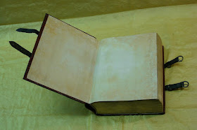
This was the first time I had attempted anything like this technique, and I had mixed feelings about the results. I made extra sheets in case something went wrong during the paste up. I picked the two that matched the closest when it came time to use them. On their own, I don't think they look bad, but they didn't really match the natural aging on the rest of the dictionary's pages. However, they were convincing enough to use, and they matched the general color closely enough that if someone were flipping through the pages, there wouldn't be a terribly noticeable difference.

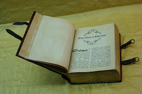
I used the same "antique varnish" paint to add foxing to the inserted pages as well, but with a much lighter hand. I laid out the interior pages in two columns, and used an Old English typeface font with justification. The text itself was lifted from latin liturgical texts (I have no idea what they say). A few pieces of line art were thrown in to break up the text. Their placement was strictly based on visual astetics. The line art was a mixture of actual medieval woodcuts, available on the internet, and drawings I had made for my Necronomicon Pages.

Additionally, there were several full color images that the clients wanted me to incorporate. I featured these as full page plates set aside from the text. The color images had to be printed after the aging of the paper because my printer does not have waterproof colored ink. As mentioned previously, these pages were "tipped in" to the existing text block by running a thin line of glue along the gutter edge, thus gluing it to the page in front of it.


With the interior custom pages tipped in, the text block cased in, and the cover embellishments all in place, the Tome was nearly finished. At this point it looked very much like many of the prop tomes I have made over the past few years. But this time I was going to try something different. This time I was going to add the finishing touch that would really sell this as an ancient tome of evil. Grime.


I started out subtlety, as this was the first time I had tried this and wasn't entirely sure how it would work. I used a black acrylic paint (which dries flat) and a dry brush and gently stabbed at the creases and crevices where I thought dirt and grime would accumulate. Also, I added the flat black to the edges and areas where I thought the object would get the most wear. In the pic above, you can just see the darkening around the edges of the leather straps and along the head and tail of the spine.

I continued this process around each side, applying grime around the edges of all the straps, bosses and the centerpiece, and also along the edges. I worked slowly, building up in layers, as actual grime would. I even took a towel and wiped off some of the paint I had added after each application. I wiped the cover as if I were cleaning it, to simulate how the large flat areas would not have as much grim build-up, because of normal handling and the occasional cleaning. I continued until I was satisfied that the book looked truly ancient and used. This simple thing might not seem like much to most people, but it represents a turning point in the realism of my prop work.

With the addition of the grime, the Tome was finished. So, here are about a zillion glamor shots of the finished piece. As you can probably tell, I was pretty proud of it.


I have one more final installment to this series of posts, which will include pictures of the set as a whole. If you are just tuning in, make sure you check out my previous posts of the other items in this set. The links are below.

See also:
The Black Duke - the Diary (part 1)
The Black Duke - the Diary (part 2)
The Black Duke - the Box (part 1)
The Black Duke - the Box (part 2)
The Black Duke - the Box (part 3)
The Black Duke - the Tome (part 1)
The Black Duke - the Set (fini)