The third and final piece of the Black Duke project was the Tome. The clients wanted something old looking to represent a dark tome, sort of like a satanic or demonic bible. At least that was my interpretation of what they said they wanted. They were originally attracted to my work from pictures on this blog of items such as the Unholy Cross of Cthigla and the 9th Gate tomes. The tome was the first item we discussed (originally it was the only item we discussed, until the project turned into three items). We talked about different design elements, color schemes, covering materials and certain other requirements they had, such as they wanted a large baphomet head image to dominate the first page of the book. They also had some color prints that they wanted incorporated into the interior. They didn't need the whole book to have custom content (which would have been expensive and time consuming as I would have had to lay out each page by hand and sew the signatures), but they did want some custom pages inserted into the body of the book, so that they could open it up and flip through a few pages on camera.
They wanted the dark red lizard skin vinyl covering cloth that they had seen on some of my other tomes, and they finally decided to go with the inverted double cross from the Unholy Cross of Cthigla as the centerpiece. They picked the gothic bosses from the back side of the Unholy Cross of Cthigla tome for all the corners. I gave them a few different size options, and they decided to go with the "big honkin' dictionary" size. It would be a very large and impressive tome indeed. The largest I had ever made.
As with most of my projects, I was eager to get started, so I neglected to take many "before" pictures. Above is the earliest image I have of the tome. It was made from a very old, large format unabridged dictionary (Webster's, I think) that I rescued from a yard sale. It was 8.5 inches wide, 11 inches tall and about 5 inches thick. It weighs several pounds. The cover was a little beat up, but usable. I removed it and cleaned up the spine. The red vinyl cloth was used to recover the original book boards. I did have to perform a little surgery on the original cover. It needed a little larger "square" at the foredge, as the original book was found lacking in that department. The spine covering was fairly soft and the French groves sort of floppy and ill defined. Before re-covering the boards with the vinyl, I decided to cut the spine down the center and paste in a piece of cardstock to make it a little wider. This would push the grooves farther around the corners and push the foredge out a bit. I also had to paint the edges of the text block, as there were these annoying black tabs visible which marked the sections of the dictionary letter by letter. The gilding would hide these spots. You can still barely see them when the book is open and the pages fan slightly.
We decided to go with about a dozen custom pages (technically it was 24 pages, twelve leafs). Some in the front, and some in the middle. I would use a baphomet image that they picked out, as well as some color prints that they had sent to me, along with some actual medieval wood cuts and a few pieces of my own line art that I decided to throw in at the last minute. For the majority of the text, I went with excerpts from liturgical texts in Latin, using an Old English style font that has a very distressed look, like very old hand carved typeface. Luckily, due to the size of the book, standard 8.5x11 pages fit into it almost perfectly, with only very minor trimming needed. Above, you can see the custom pages drying after receiving their aging treatment of black tea, coffee, and walnut ink. The color images had to be printed after the pages were dyed, as the color ink from my printer is not waterproof. Later, these pages would be "tipped in" to place by using a thin strip of glue along the spine edge of the new pages and inserting the pages in the desired location (effectively gluing it to the page in front of it, just along the edge closest to the spine, also called the "gutter"). The original pages of the dictionary were badly yellowed from age (and being printed on poor quality paper), so they would match pretty well to the color of the custom pages if the camera caught someone flipping through the book.
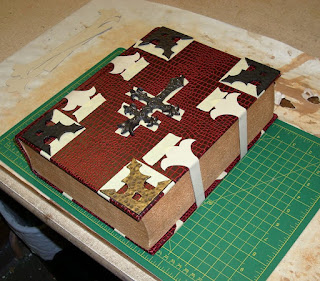
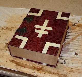
I started designing the cover by laying out the cast resin pieces that I knew I was going to be using. Then, I marked their relative size and location with some masking tape, so that I could see their positions while I was working on other elements.
I decided to go with two thin leather straps with buckles to close the foredge of the book. To balance the design, I went with matching leather straps as decorative pieces across the spine. I started out by working out my design, size, and spacing by making a template out of card stock.
Next, I cut out the pieces from black latigo leather, using the paper templates as a pattern. Even though the leather I used was thick and a little rough, there still needed to be some dressing done to them in order to make them look old and distressed, much like the leather covering and thong used on the Diary. I started by giving them a good rub down with some mink oil. Then I beat the crap out of them with a hammer, giving them dents and marks to simulate age and use. That wasn't enough. I was going for a very old look, so I need a convincing aging of the leather. Next, I took a hobby knife and started making small careful cuts to the surface of the leather, especially along the edges and at corners to simulate nicks, splits, and cracks. In addition to straight slices, I also cut out small triangular wedges for deep splits. This looked pretty good, but still wasn't convincing enough. The real magic happened when I hit the pieces with the propane torch. Just like with the thong from the Diary, the heat from the torch made the leather dry up and shrivel slightly. It exaggerateded the cuts I had made and made them look more like cracks and splits from age and abuse from years ago. It also removed the fuzziness of the flesh side and around the edges, which is a dead giveaway that the leather is not old.
Once the leather pieces were appropriately aged, I could start adding the necessary hardware. The buckles I used were from a craft store and had an antiqued brass finish. In attaching them to the leather, and for attaching the leather to the covers, I used a combination of leather glue (pva) and rivets. The rivets were two part quick rivets that also had an antiqued brass finish. You can see the leather being glued and clamped in the image above the paragraph above. However, the brass collars that hold the strap in place after it is buckled (I have no idea what the technical term for them is) were hand made by me out of sheet brass. Well, actually it turned out that it was steel with brass plating, but that didn't matter much. Making the collars was a big pain in the ass. It involved a lot of heating and hammering, and I don't have a proper anvil anymore for this type of work (I lost my mini anvil in a move), but they turned out really well. I didn't want a sharp edge, so both of the edges had to be turned under. Trying to use a hammer and a pair of pliers to fold a strip of metal lengthwise along it's edge, that is only about 3/4 of an inch wide to begin with, was a real chore. I dry brushed them with black acrylic paint to try to match the antiqued finish of the buckles.
Once the buckles and collars were in place, I started attaching the leather pieces to the cover. The strips that go around the spine were attached first, by placing two rivets in the center of the spine on each strip. Then the book was closed with the text block in place and the decorative ends were glued in place to the front and back covers. No glue was used along the strap, just on the ends. If the book had not been closed when they were glued down, the book would never have been able to close, as closing it would have stretched the leather straps around the hinge. If the straps had been glued down, they would not have been able to buckle as the book was opened and again would have interfered with the working of the hinge. You can see the buckling at the hinge in the picture above. This happens because the hinge of the leather straps and the hinge of the book are operating on a different radius, because one is outside of the other. Obviously it would have been difficult to hammer the rivets with the text block in place, so to do that I hung the cover over the edge of a sturdy table.
The leather straps at the foredge were attached the same way, glued and riveted. This was the first piece that I have made that used this double strap design for a closure. I like it a lot, but it was a lot of work to make.
Tune in next time for the addition of the cast resin pieces and the finishing touches.
See also:
The Black Duke - the Diary (part 1)
The Black Duke - the Diary (part 2)
The Black Duke - the Box (part 1)
The Black Duke - the Box (part 2)
The Black Duke - the Box (part 3)
The Black Duke - the Tome (part 2)
The Black Duke - the Set (fini)
Play That Funky Music
-
The Museum of Cryprozoology and Occult Science brings us this creepy skull
lyre made from a real human skull, antelope horns, skin, gut, and hair.
What ...
2 days ago


No comments:
Post a Comment