
The upcoming film is called "Doctor Glamour". It's kind of a campy lovecraftian themed oddity set in a steampunk alternate Arkham. Oh, and did I mention, it's a musical! The client, independent film director Andrew Jones, didn't give me much in the way of requirements or specific direction. In fact, about the only specific direction he gave me was to avoid the color green, as the film was going to be shot in front of a green-screen. But he did send me links to his production blog and to the film script. There was enough detail there for me to get a good idea what he was looking for.
As with most commission jobs, time was short, and as usual, I spent too much of it wrapping my head around the project, waiting for design ideas to "click". Once they did, I had to put in some very long nights to make the deadline.
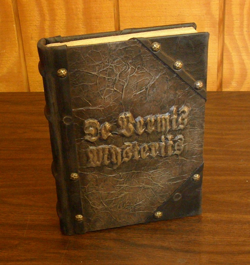
The first tome I worked on was the De Vermis Mysteriis. The first step, after doing a bit of brainstorming, was to select a base book of the appropriate size. I had intended on using a larger book than I ended up using, but because I wanted there to be a significant size difference between the two tomes and I was having trouble finding a base book for the Necronomicon that was as big as I wanted, I settled on an average sized "New Standard Encyclopedia" (volume "B"). I removed the text block from the case and cleaned up the glue in the usual way. Then I sanded the boards a bit so that the new covering material would adhere better.

I knew that I wanted to have the tile in raised letters on the cover for this one, but I wasn't sure exactly how I was going to accomplish that. I had thought I would cut the design out of chipboard and glue it to the cover and then use my crumpled paper technique over it. But even after selecting a font with minimal serif, cutting it out of chipboard was going to be far too difficult. I decided to try an experiment. I printed the title out to full scale and laid it over a rolled out piece of Sculpy.

At first I started cutting through the paper and Sculpy with an Xacto knife, but that was still too difficult, especially around the tight corners. So I lifted a technique from Michelangelo, and poked tiny holes through the paper with a straight pin, following along the edges of the design. The holes created dimples in the Sculpy that were visible enough to follow after the paper was removed. I then followed the outline of holes and cut out the letters with the Xacto knife, very carefully.

This technique worked better than I had anticipated. Cutting the letters out of Sculpy was far faster and easier than I thought it would be, and WAY easier than cutting them from chipboard would have been. I also got a much cleaner edge. I had been smart enough to lay the sheet of Sculpy on a thin metal sheet that I could put directly in the oven without having to move the letters.

After the letters were baked, I glued them to a piece of hardboard and gave them a coat of sealer. The I created an RTV silicone rubber mold of them. I could have used the Sculpy originals on the tome, but I was afraid I might screw something up, and have to cut them out all over again. This way I could make a resin copy of the letters and re-cast them as many times as I needed. The resin casting actually came out very nice and in one piece, with a very very thin membrane of plastic holding all the letters together. This would normally be considered "flash" and be trimmed off, but in this case it was actually helpful in keeping the letters aligned.


I glued the resin title to the front cover board, flash and all, and used the crumpled kraft paper over it and also the back cover board. Then the paper was given a base coat of black acrylic paint, which was followed up with a sponged on stippling of dark brown, and finally dry brushed with a light golden brown acrylic paint. I had never used brown paint for this technique before, and I have to say the resemblance to leather was uncanny.


After turning in the edges, I stuck the book-block back in for a test fit to make sure everything was hunky-dory. Also, this gave me an opportunity to set the groove with my bone folder.

I added a strip of chipboard to the spine to strengthen and stiffen it. I also glued on pieces of cut heavy cord to simulate raised cords on the finished spine, which would soon be covered in soft black leather.


I got the leather that I used for the spine and corners from cutting up an old leather jacket that I bought from a thrift store.


The last step before antiquing was to add brass upholstery tacks along the edges of the leather. I actually liked the look of the book so much at this point that I considered not doing any more antiquing to it. I think I may make some more books in this same design.

But the antiquing must go on, so I pulled out a couple of the upholstery tacks and painted around the edges of some of them (including the empty spaces where tacks were removed) with some green faux patina paint. I also used a dry brush with brown and black around the edges and on the leather itself for some aging and grime. I made a few small slits in the leather with an Xacto knife and lightly sanded it in places. Then I took a mini butane torch to some areas, especially the slits, which the heat opened up wider and made look older and more natural.

The final step in preparing the cover, was to apply some gold Rub-N-Buff to the raised letters on the cover.

All that was left to do was to deal with the text block. I hadn't originally planned to, but I ended up giving the page edges a light shot of gold paint to simulate old worn gilding. The tome was going to be open on screen, so it needed to have some custom interior pages. The client only wanted two custom pages, but I ended up giving him four, so that he had the option of turning a page on camera. The custom pages feature a few of my pieces of line art that I made for my Necronomicon Pages. The text is actually spells taken from our public book of shadows here at the shop and laid out in a nice Old German font similar to the title. I aged and trimmed these pages and tipped them in to the center of the text block.


The last step, of course, was to case in the text block.
And here it is. De Vermis Mysteriis, all ready for its big screen debut!


... Tune in next time for pictures from the making of the Necronomicon.
See Also:
Doctor Glamour - The Necronomicon (pt. 1)
Doctor Glamour - The Necronomicon (pt. 2)
Doctor Glamour - The Necronomicon (pt. 3)
Doctor Glamour (fini)


Great Work.
ReplyDeleteI wish i qould be that talented.
Keep on going with this great work.
One day i might have enought money to get my own special book from you.
This is awesome and has inspired me to have a go at making a tome like this. I have made an Indiana Jones Grail Diary by hand and wanted another project to do.
ReplyDeleteHave to visit the thrift store for a cheap leather jacket and see what books they have I can mod up.
Brilliant site.
I'd like to try this on a bible. I've been looking for an ancient looking bible but, don't want to spend $100.00 or more for it. I'm going to have to find a way of doing it to wear I don't have to take the pages out though!
ReplyDelete