Saturday, December 19, 2009

Statuary

A couple of months ago, I picked up some old encyclopedias at a thrift store. While I was there, I also bought a crappy plastic mold kit for making "green man" faces out of cement. I guess people use them to decorate their gardens. Anyway, pagans like green man sculptures and it was only $5 so I thought if I make one casting and sell it for $5, it will have paid for itself.

I set aside the cement that came in the kit and decided to test the mold with plaster instead. I mixed Plaster of Paris (hereafter referred to as PoP) with dental plaster, which is much more expensive but about 20 times stronger. The first casting I made came out very badly, as the plaster started to set up before I got it all into the mold. I decided to let it cure anyway and use it as a test piece. After I finished painting it, I actually like it better than the one that came out "good". It looks like an ancient piece of stonework, ravaged by time and the elements.

This kind of got me into a plaster casting mode. I started looking around the shop for other things I could make plaster castings of. I selected two "sun" plaques and started making latex rubber molds of them, but that effort was stalled when I ran out of rubber. The local craft store usually caries it, but they have been out of stock for a month or more. Then my sales clerk brought in a collection of candle molds for me to try out. She has about a dozen different molds, some rubber some plastic. I tried out five of them so far. Here are some of the results.

I again used a combination of PoP and dental plaster (Excalibur brand). I had to touch up some surface air holes and the Bast and Goddess molds left a lot of flash that needed to be cleaned up and smoothed out. Then I used a clear sealer on them before painting. I gave each a base coat of black acrylic paint, followed by a rough coat of blackened bronze metallic paint (intentionally missing some spots). Then I used a spray on matte sealer followed by highlights dry brushed with blond bronze metallic paint. I used the sealer before the highlight coat because my first attempt started to pull the bronze and base coats off when I dry brushed. I think the finish looks even more realistic than my usual "antique bronze" finish that I use. The main difference being that I normally mix the blackened and the blond bronze for my mid coat and use gold acrylic and rub-n-buff for the highlights. This method, of using the blond bronze for the highlights, seems to give a more muted finish that seems more realistic to me.

I liked the way these came out so well that I decided to sell them for $25 each in my shop. I think that is still a pretty good price as statuary seems to be pretty expensive. This past summer we had ceramic god and goddess statues that were consignment pieces. They were very plain and wobbled on their bases something terrible. I didn't think much of them at all. Our consignors wanted $45 each for them and they both sold. If these sell well, I will definitely be making more of them.

Pen Madness (part 5)

It dawned on me that the fastest pens of mine to sell were the very cheap and simple ones, so the other day I whipped up a few more very cheap and simple ones.

I made all of these in under two hours. It would have been faster except that the three colored ones gave me a little trouble. I decided to wrap the shafts all the way up to the veins this time. The black and white ones are wrapped in a synthetic raffia, called wraphia. It was very easy to work with and creates a nice clean simple finish. The colored ones were wrapped in thin satin ribbon. They were much harder to do. The ribbon did not want to cooperate and kept puckering at the top edge. I got them done, but they took three or four times longer and with more aggravation than the wraphia ones.

I am not too thrilled with the quality of the feathers available at my local craft store. They look pretty pitiful, and these are the better looking ones. I need to find a good supplier on-line for some better quality feathers. If you know of any, please drop me a line.

And because I'm such a glutton for punishment, I bought more pen nibs, bottles and ink last week. It will now probably take me well over a year to recoup my expenses for this product line. On the up side, I now have nibs and bottles enough to make upwards of 720 pens and 576 bottles of ink. So I have that going for me, which is pretty nice. Some one stop me, please!

Monday, December 14, 2009

Cthulhu Cycle Books Paperback Recovers #3 & #4

Here are two books recently finished and for sale now on eBay. They are Cthulhu Cycle books, published by Chaosium, that have been re-cased with custom hardcovers. Their design is very similar to the first and second paperback recover projects that I did earlier this year.

The books that I chose to recover are "The Three Impostors", and "Disciples of Cthulhu II". Actually, I had originally intended to recover "Arkham Tales", but I made a mistake in my original calculations and the cover I made for "Arkham Tales" ended up being too small. The book's pages stuck out past the boards on the fore edge. Fortunately, "Disciples of Cthulhu II" was a little smaller and fit the cover I had made.

While "Disciples of Cthulhu II" worked out nicely in the green cover intended for "Arkham Tales", "The Three Impostors", in the blue cover, gave me some problems. Due to a flaw in my covering method, the French grooves at the hinge practically disappeared. This created a problem with the book opening after the text block (main pages of the book) were glued into the case (cover). I ended up having to tear it out and do it over. Unfortunately the error could not be corrected without destroying the cover and starting over. The only compromise possible was to glue the text block in and let it dry while the book was open (which is not the normal way of doing things) and let the end papers wrinkle up when the book was finally closed. I managed to keep the wrinkles confined to the rear end paper. Not my best work and certainly not a desirable outcome, but I decided to let it slide rather than start over. If it doesn't sell the way it is, I suppose I will either keep it for my own copy, or I might eventually disassemble it and try some radical repairs.

If you are interested in bookbinding, I recommend you visit the Book Arts Forum. It has a very nice collection of book and paper arts enthusiasts who are very helpful.

Wednesday, December 9, 2009

Unholy Cross of Cthigla

I have a lot of book projects all coming to completion this month, so prepare yourself for rapid fire Mythos tome mania!. Hot on the heals of my Black Book of Evil, now all bear witness to the Unholy Cross of Cthigla.

This is another recovered encyclopedia static prop book. It measures 10.25" x 7.75" x 1.5" and weighs 3lbs. 3oz. It has been recovered with green reptile print vinyl, and appointed with cast resin bosses and centerpiece, all finished in my classic antique brass/bronze. The hasp mechanism on this book is something new. It utilizes two D-ring hasps, with antique brass finish, that are riveted to the front and back covers and are held closed with a small brass padlock.

The front and back covers feature two different kinds of ironwork style bosses (corner pieces), one of which has been replaced by a cloying unearthly tendril. The4 centerpiece is of an ornate gothic double cross which has been affixed in an inverted position. The pages have gold gilt edges. The spine is embellished with a name plate made from chipboard and hot glue featuring indecipherable symbols and a matching antiqued brass finish. A black cloth ribbon bookmark attached at the spine gives this piece a touch of elegance.

There is nothing particularly innovative about this book, except for the D-ring hasps. For the most part, it is a repeat of previous encyclopedia recover projects. But more of something good is never bad :)

This tome is currently up for sale was sold on eBay.

Saturday, December 5, 2009

Vesica Piscis


This past summer, after seeing my BoS a la Charmed , a friend of mine asked me to make her a similar one in blue featuring a silver Vesica Piscis on the cover. She offered to pay for it in advance (which I declined) and seemed very eager about the project. She asked about it nearly every time we saw each other. First of all, I hate doing custom work for people. I do not work well on any time table but my own. I also have difficulty working on a job that I do not feel inspired to do at that moment. I work as the spirit moves me. That ethos is not conducive to meeting client specifications or deadlines. I guess you could use the analogy that I am more of an artist than an illustrator. I put off the project for several weeks (months) until she started getting perturbed. Finally I started working on it, rather than risk any trauma to our friendship.

This is a large sketchbook. The front and back boards were thickened and given a border with chipboard. It was then covered with crinkled brown paper using the white glue and paper method and finished with the faux leather effect. It was painted black, then sponged with two different shades of blue, and finally dry brushed with silver. Silver half round upholstery tacks were used in the corners for decoration, and silver snaps hold the heavy black (bonded) leather straps that were cut from an old belt.

The front design was a little more complex than I usually do in these types of projects. Cutting intricate curves, especially tight ones, are a pain when working with chipboard. But these ones didn't turn out to be that bad. Most of the curves were gentle enough not to create much of a hassle. I had more difficulty getting the coloring right on it. I had to repaint it several times to get the antiquing just right. Too bright and it looked very flat and artificial. Too dark and it looked dingy and dirty.

The final touches were a black cloth ribbon bookmark and new gray end papers. As a gesture of good will, I decided to give it to her as a Yule gift. She picked it up today and seemed very pleased with it.

Thursday, December 3, 2009

Thing in a Bottle v1.0


This is my first attempt at making a Lovecraftian "Thing in a Bottle." The jar itself originally held bath crystals and stands about eight inches tall. It came with a cork stopper (one of those crappy reconstituted kind). I soaked the cork in a hot pan of melted paraffin wax and held it under until all the air bubbles were gone, completely saturating it. I expected that would take care of any leakage or evaporation issues. Sadly, it did not.

The thing inside the bottle is a toy starfish that I got at the dollar store. It is one of those kind that grows "600 times its size" in water. It did not grow 600 times its size, but it did grow substantially. Probably more like a 600% increase in size. I saw on another blog last year someone suggested using these to create creatures in bottles, and I thought the idea had merit. I searched around for a while before I found the right kind of toy.

I wanted to test the toy and see how big it would get (and if indeed it would grow at all) before putting it in the jar. I placed it in a bucket with water and left it there for several days. The growth is very slow, and after it has expanded, it ends up covered with a weird sort of jelly slime like substance. The slime is clear, and though it felt good and icky, it wouldn't help my project any, so I washed that off and then let the toy dry out and shrink again (which also took several days). Before placing the starfish in the jar, I painted it with latex rubber and a little acrylic paint. Then I rubbed some of the latex off, to create holes in the coverage. This made for a very interesting mottled sloughing skin sort of effect.

Once stuffed into the bottle, I refilled it with water and let the expansion begin again, refilling as needed. When it had filled the jar, I topped it off with water and added a few drops of green and yellow dye. In hind site, I should have added more dye and maybe something to make the water a little more murky. The starfish is still a little too visible and identifiable. Then I put the cork in. That was much harder than I thought it would be. Because there was very little air int he bottle, and the cork was not readily permeable, the laws of hydraulics made it very hard to get the cork to stay in. The compression of the little air that was trapped inside kept pushing it up. I was worried that if I pushed down on the cork too hard, the glass bottle would break (that's how hard I had to force it in). I did my best to force the cork down and left it sit for a while. Within a few minutes, I started noticing small droplets of colored water forming on the top of the cork. The pressure inside was causing the liquid to force its way through the cork, even through the wax. I figured that once enough pressure was released, the leaking would stop and the very few pours in the cork would seal themselves up again.

I used an old trick I came up with when I made my Ichor of Abn-Sur prop, and tied the cork in place with hemp twine. It makes for a very un-modern looking yet sturdy seal. I never liked the 'whole bottle top glommed with wax' look that many people use. I had intended to make a Miskatonic label for the bottle, but I never got around to it. Recently I took a look at the jar to measure it for the lablel, and I noticed that some of the water had indeed evaporated even through the wax saturated cork. The top of the starfish is now sticking out above the water. I find this unacceptable, and very disappointing. I guess I will just have to disassemble it and try again. Back to the drawing board.

Monday, November 30, 2009

The Black Book of Evil

Here is the fifth book in the encyclopedia re-cover series (aka Good Books Gone Bad). I call it "The Black Book of Evil." It is up for sale on eBay right now was sold on eBay. As always, click through for larger images.

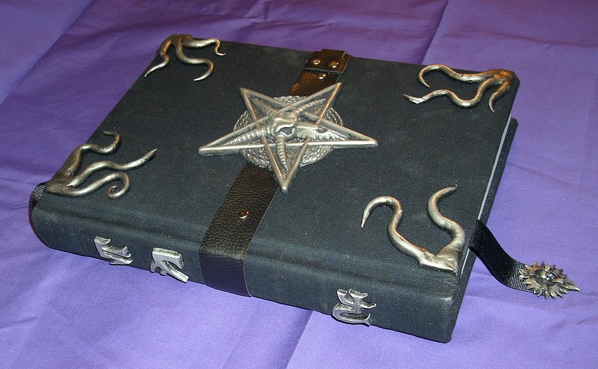
I used a different encyclopedia set this time; Encyclopedia Britannica. I picked them up recently at a thrift store for $1 per volume. I don't remember which volume this one is, and it's not in front of me to check (like it matters). This set had silver gilding on the page edges (actually, just on the top edge. I had to paint the other two edges to match) so it seemed like I should decorate this tome with a silver finish rather than my ubiquitous bronze. These books are nice and big and heavy. The finished product weighs about 4.25lbs. and measures 11.25" x 9.25" x 2.5".

First I recovered the book's hard cover with a dark black cotton fabric. That part went quite fast, as it covered rather nicely. Well, actually, first I painted the two remaining raw edges, then I recovered it in black cloth. Next I picked out my decorative pieces. I had to do a special run of resin castings because all the ones I had pre-made already had a base coat of bronze on them, and I didn't want to repaint them. I decided on tentacles at the corners and the baphomet head, which I have used before, for the centerpiece. There were a couple of small details that were different about these pieces. The centerpiece was an experiment I had done with using powdered nickel-silver brushed into the mold before pouring the resin and later polished with steel wool, so actually this piece was not painted (except for a black acrylic wash to antique it), but is closer to a cold-cast metal (at least on the surface). The tentacles are a new set. A month or two back, I decided I needed some more variety in my tentacle corner pieces, so I sculpted five new originals out of sculpy and made new molds of them. This is the first finished product that incorporates the new tentacle designs.

Up to this point, everything was pretty straight forward. Things got a little more complicated when it came to the closure. I'm always looking for new closure designs. I get tired of the same old brass hasp and hinges set-up that I've used multiple times. This time I went with a black leather strap which encircled the girth of the book. I riveted it to the front and back covers and placed the centerpiece right on top of the strap. Then I sat and pondered how I was going to close/lock it for about an hour. I had an idea to use a silvered buckle instead of a hasp and lock, but my locking silver buckles were too big. They didn't look right. I had a much smaller regular buckle, but that would require making the strap thinner at the buckle. After some ruminating and hesitating. I decided to go ahead and make a secondary strap that would rivet onto and over the main strap, that was the appropriate size for the smaller buckle. I tucked the main strap's ends between the text bock and the cover boards, and wrapped the smaller strap around the edge to buckle in the back. This was a time consuming process, not only because I had never tried to make this design before, but because I was making it up as I went along , and I had to wait 15 minutes for the glue to dry at each stage of its construction. If I had the design planned out better from the start, I could have saved a considerable amount of time. C'est la guerre.

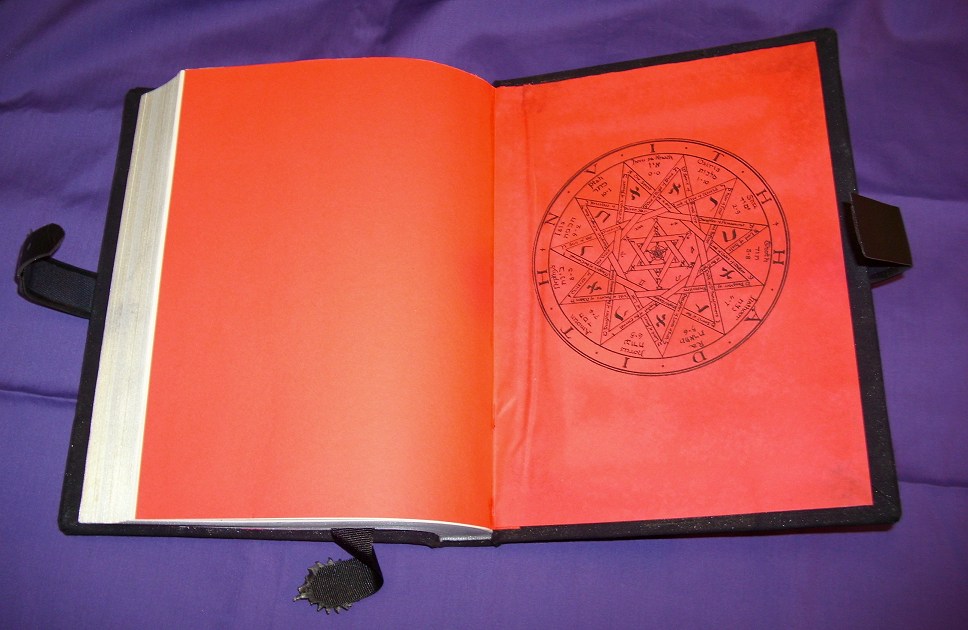
I installed red end papers on the front and back covers. Before pasting them in, I picked out a couple of nice geometric sigils from the public domain and ran them through the printer. In the spine, I attached a heavy black cloth ribbon bookmark. Due to its width, I wish I would have attached it to the back cover instead of the spine, but I had already glued in the end papers. To finish off the end of the bookmark, I decided to attach a small resin casting of a piece of jewelry I used to carry in my shop. The company that designed it is out of business, I believe. It is a blazing sun with a skull and an equal armed cross at its center. I finished it in the antiqued silver, like all the rest of the resin pieces on this book.

Along the spine I did something different. Instead of attaching a title plate made from chipboard and hot glue, like I did on my last two books, I created some heavy cast resin glyphs to fix to the spine. To make them, I started with a piece of oil based modeling clay rolled flat. Then I measured the spine to decide on the dimensions of the glyphs. Once the size was determined, I made a grid on the clay, and in each square I carved out a glyph by hand. Once I had about eight glyphs carved into the slab (some for now, some for later), I poured resin right onto it. Cleaning out the clay from all the crevices, and trimming the flash was a little tedious. I also rounded the edges of each cast piece with a dremel. Then I finished them with the antique silver paint job and glued them to the spine.

I'm actually quite pleased with this tome. I think the finished product looks pretty good. This project saw several new innovations. It used the new tentacle castings on the corners. The centerpiece featured a cold cast metal finish instead of paint. The end papers were printed. The leather belt and buckle arrangement was a new design. The bookmark fob was new, and the raised resin glyphs on the spine are a first for me. This is the first of the new encyclopedia set, and it is the first of the re-cover series to be finished in silver. I also normally like to make these static props locking, but this one just has a buckle. I hope you enjoy it (and especially whomever buys it). As always, I am open to your comments.


Saturday, November 21, 2009

Plastic Cthulhu

OK, now to get back to what you all came here for, some Cthulhu stuff. This past summer, Propnomicon posted about a new little trinket from Fantasy Flight Games, the Bag of Cthulhu. It is a package if small plastic Cthulhu miniatures, some about 3 inches tall (55mm), and some about 3/4" tall (20mm). They were designed to be used with a Cthulhu based card game, but even though I had no interest in the card game, I immediately I knew I had to have some of these miniatures.

They look cool as hell, and the detail on them is quite nice. My only criticism being that on some of the larger ones, the mold seam is a little too visible. Though this could probably be trimmed off with some diligence and a sharp x-acto knife. The color scheme is not that terrible, a dark oily looking grayish green, but they definitely look like plastic. I had read on someone's blog post somewhere that due to the type of plastic they are made from, they were very hard to paint, however, recently I decided to take a stab at it, and they didn't seem that bad.


Expecting to run into problems, I tried several brands of spray paint and primer, Rustolium Plastic Primer (white), Krylon Primer (white), Testers Primer (grey), Krylon Fusion (satin black), and cheap Wal-mart brand flat black, with varying results. All of them faired well enough to be usable, but the one that dried the fastest and seem to have the best adhesion was the cheap flat black from Wal-Mart. I did nothing to try to sand or de-gloss the figures before painting.


After a base cloat of flat black (over the primer where necessary), I gave them a light coat of Sophisticated Finishes metallic paint, which is my favorite for creating a metallic finish (especially my ubiquitous antique bronze). Then I gave it some highlights with gold Rub-n-Buff. This was my first attempt at refinishing these little plastic miniatures, and I am rather pleased with the results so far. I did notice that the seam line becomes even more pronounced with the new finish. Next time I will take the time to try and smooth it out before painting. I plan to incorporate some of these figures into some prop ideas I have. I also saved one of the refinished smaller miniatures to use as my token when my family plays Monopoly. :)


I was looking around my house for a good place to display one of these. I finally decided that I would replace the bronze finial on top of my desk clock in my Victorian styled computer room with the larger of the two small statues statue. I think he looks quite nice sitting up there. The muslin bag full of Miskatonic goodness from Propnomicon is not a product placement, or a stage setting, that's just where mine happened to be sitting when I took the photo.