It seems like the only time I get to post anything is when I am off of work for some reason, which isn't often. This time I am home sick with bronchitis. So that makes it a wonderful opportunity to post about one of my projects I recently finished.
This project took a LONG time to complete. Way longer than it should have. I experimented with a few new techniques, a few new materials, and I was never really sure where the design was going. All in all I'd say I have mixed feelings about the outcome. It started when a friend of mine, we'll call him "Eric" (because that's his name, -duh), left his Dungeons and Dragons 3.5 edition Dungeon Master's Guide at my house after a game session. Before I could return it to him, the book got dropped and the spine cracked. I promised to fix it for him, though he didn't really care. He would have just replaced it. That's the kind of guy he is. It took me almost a year to make good on that promise!

For those of you who are not familiar with it, here is what the D&D 3.5 DMG looks like. The cover image evokes the feeling of a 3D sculpture, and that's what I wanted to do with this re-cover. I envisioned a multi-layered design with ridges, baubles, and thin strips of riveted metal trim. That is not quite what I ended up with.
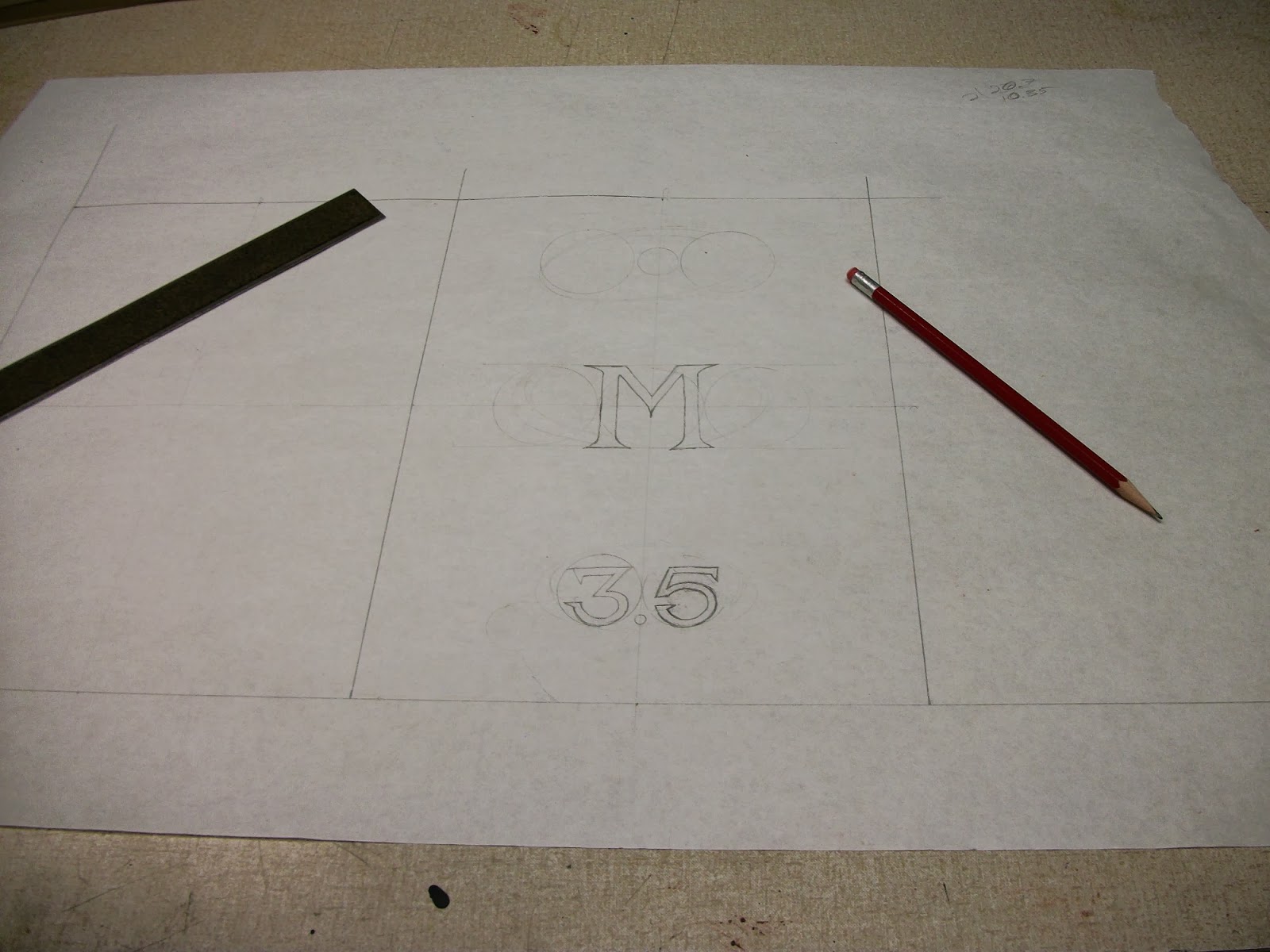
To begin, I started sketching out some designs on butcher paper at 1:1 scale. I had no idea where I was going with it. I just sketched as the spirit moved me. One thing I knew I would need for sure were titles. So I started with those, figuring I could design the rest around them.
Then I sketched a framework around the title elements. What I ended up with was a sort of art deco style applique.
I glued the original sketch to some chipboard and cut it out with a hobby knife.
Then I got around to fixing the broken spine with some tyvek. As with many modern RPG books, there was no mull in this book. It relied entirely on the strength of the end paper and the varnished paper covering material to hold the boards to the spine. As pretty as varnished paper can be, I think it makes a lousy covering material, and even more lousy text block pages. It is brittle and cracks and tears easily. It was the varnished paper covering material that cracked and split when the book was dropped.
I used the cut out chipboard as a template to draw the same framework design for the back cover, and also to make an archive copy of the design, in case I ever want to use it again. Since the back cover didn't need the titles on it, I put cut outs in the areas where those were.
Then I cut out the back cover applique and glued both to the original cover boards, after roughing the original covers up with some sand paper. Another drawback to varnished paper covers. Glue doesn't want to stick to them.
I wanted the titles to be 3D too, so I re-drew them on some thinner chipboard (a shirt box) and cut them out, gluing them directly over top where they were originally drawn on the cover sketch. As you can tell, I'm not really good at drawing custom fonts.
For covering material I was trying a new product that I had purchased a few months earlier and was dying to try out, bonded leather. The look and feel of leather at a fraction of the cost. When I first got it I thought it looked great. But now that I have worked with it a little, the honeymoon is definitely over. The surface looks and feels more like vinyl than leather, and it has much different handling properties than working with leather. It doesn't absorb glue the same; it doesn't stretch the same. I don't like it. I don't like the look of it, and I don't like working with it. But I have a bunch of it, so I guess I'm stuck with it.
After gluing down the bonded leather covering material, I filled some large zip-lock bags with sand to use as weights that would conform to the intricate curves of the appliques and hopefully give me a nice contour to the leather.
Then I added more weight to make sure I got the best possible compression. A
lot more weight.
Sadly, the results were unimpressive. I have successfully used the sand bag trick before on a smaller scale, so I had high hopes. But after the weights were removed, the leather showed poor definition around the appliques. Time for plan B.

I went down to the local pharmacy and asked for some medium sized syringes. After explaining what I wanted them for, and convincing the pharmacist that I was not a junky, he agreed to sell me some. I needed a needle that was big enough to let watered down glue flow through it, but that was small enough not to damage the leather with a noticeable hole. I think the ones I got were 25 gauge. I injected the cover with some more glue at all the edges of the appliques, working it around by massaging the leather with my fingers. Then I took the cut out pieces from the original appliques (thank goodness I hadn't thrown them away yet) and taped them down in their respective places. Then I reapplied the weight and let it dry. I only did one half at a time, because I had no idea if this would work.

Success! You can see in the picture below, the difference in definition that the chipboard pieces made compared to the sand bags. Not all of the areas were as crisp as I would have liked, but it was a vast improvement.
I repeated the process to the other half of the cover and finally I got something that I thought was passable, though I wasn't thrilled with it.
The cover of this book was going to be busy and bright with lots going on (or at least that's what I wanted), so the subtle raised letters of the titles would simply not do without more embellishment. I decided to try another experimental technique, gold leafing. I had tried it once before on a small leather journal, but the results were unimpressive. I don't know why I though it would be different this time, but I was hoping for something akin to a miracle.
I applied the sizing agent (glue) to the cover as carefully as my artistic skills would permit. Then I covered the affected area with a thin delicate sheet of fake gold foil. Then I covered that with a sheet of waxed paper and used a rolling pin on it to ensure good adhesion. Then I carefully flicked away all the unstuck foil with a paint brush.
The results were, once again, not particularly impressive, but at least it did make the titles pop. I probably could have gotten at least as good of an effect with a gold paint marker. Maybe it's because I can't draw for crap.
Moving on, It was no use crying over amateurish gold leafing. Time to bring the rest of this design marvel to life, starting with some brass studs. These were brass upholstery tacks. The holes were all pre-drilled. A drop of super glue was applied to the shaft of the tack. The tacks were hammered through the cover. Then the protruding shafts were cut off from the underside with wire cutters and ground down flush with a Dremel tool.
My grandiose plans were being whittled down to much more simple designs. Instead of the complicated multi-layered metal trim pieces I had sort-of envisioned, I opted for some much more feasible metal appliques to fit into the recesses of the art deco framework. These were all hand cut from a sheet of thin copper sheet (I think it was something like 30 gague). They were glued on with Barge brand contact cement, the best contact cement I know of.
And then I added brass brad heads in the same fashion as the brass upholstery tacks. This was the first time I had used sheet metal in this fashion. In the future I would stay away from acute angles. They tend to get pokey, even if glued down well.
The text block was cased in with a proper mull and grey end papers. I had a little trouble with the spine as the original text block was a "perfect bound" glue binding, but I sorted it out in the end. The pva glue from my new mull didn't want to stick to the glue from the perfect binding, and ended up with the new mull pulling away from the spine, but glued to the end papers. I solved this by cutting up some tiny floral glue beads into thin slivers to fit down the gap at the spine, then applying a hot iron to melt them. This affixed the old perfect bound spine to the new mull nicely.
I don't think the book turned out terribly, but I wasn't really happy with it. And of course Eric could care less about a custom cover. He just wanted a functional book. Some of the new techniques and materials didn't turn out as well as I would have hoped.