Tuesday, August 31, 2010

The Black Duke - the Box (part 1)

As previously mentioned, "The Black Duke" was a series of prop items that I was commissioned to make for an independent film project being mounted by Blackedge Productions. This set of items represents a turning point, in my mind, in my development as an artist. The set consists of three pieces. The Diary, The Box, and The Tome.

Once I had the Diary well underway, I began working on the Box. I already had a suitable pre-fab box that was the right size and had an interesting "treasure chest" sort of shape. I thought it would be perfect for this project. I had been sitting on it for several years, just waiting for the right project for which to use it. I do that a lot. My biggest problem (in that regard) being that I am always loath to actually use something I have been saving for fear that I am wasting it and that a better project for which it was more suited will come along. I tend to collect stuff, even when I don't mean to, and I have a hard time letting things go. I did make an attempt to find another box for this project, but it was soon clear that this was the one, so I gathered up my courage and got down to business.

The client had specified that he wanted a design on the lid of the box. It was to be the emblem of the Duke, so a medieval looking coat of arms design. I warned him of the limitations of my engraving skills, and after several rough ideas were emailed back and forth, a design was chosen. The design is a rampant lion in a shield. I have seen this design many times before. To me it looks like the Lowenbrau emblem, so that's how I thought of it while I was working on it. Sort of my own personal joke.

I took the image that the client sent to me and did some clean up to it in photoshop. Then I printed it out, traced it with a sharpie, and re-scanned it to get the image that I would use to transfer the design. I did this to get nice sharply defined lines instead of the dithered pixilated image I started with. I transferred the design using carbon paper and an embossing tool (ball pointed scribe).

Once the image was transferred to the top of the box, I set about engraving it using a Dremel tool. After it was completely engraved, I colored in the grooves with a black sharpie. This gives the appearance of age darkening and looks good after the box is coated with a dark stain.
"Tonight is kind of special..."
To stain the box, I decided to try something new. I had read about a technique for aging wood using a solution of steel wool dissolved in vinegar. I had tried it once on a scrap piece of wood back when I first heard about it. It turned the piece of pine wood black after a few minutes. The bad part was that it took several days for the vinegar to dissolve the steel wool, and it doesn't keep. You have to make a new batch for each project. So I set some steel wool and vinegar in a jar to get things rolling. I'm not sure if it was quite ready yet, but after a few days I decided to test it out on the inside of the box. To my surprise, it did not turn the box black, but rather a nice deep tone of brown. It looked rather good, and I thought I had found a good alternative to wood stain.

Unfortunately, after covering the whole box with the solution and then allowing it to dry for several days while I continued work on the Diary, the finish took a turn for the worse. The surface of the wood became chalky and more of a pale rust color than brown. Also, the finish would rub off of the surface like dust, leaving the wood barely discolored. It was not at all like the test pieces, and not at all acceptable. So I went back to plan A, which was to use a gel stain on the box and make it a nice dark walnut brown.

Here is the box all nicely engraved and stained. The stick under the lid is there to keep the lid open for ventilation wile the stain dries.


At this point I thought the box looked very nice and would have sold in my shop for sure. I loved the look of it and I dreaded what I knew was about to happen...
(to be continued)

See also:
The Black Duke - the Diary (part 1)
The Black Duke - the Diary (part 2)
The Black Duke - the Box (part 2)
The Black Duke - the Box (part 3)
The Black Duke - the Tome (part 1)
The Black Duke - the Tome (part 2)
The Black Duke - the Set (fini)

Sunday, August 29, 2010

Etched Glass Potpourri Jars

While I was doing some glass etching the other day, I cranked out a couple of these etched glass potpourri jars. I have had the potpourri filling sitting around in sealed bags for a while. I made two of them a few years ago, but they didn't sell well. I thought if I made a whole line of them they might have a better chance. Anyway, I want to use up the jars. I am switching from bulk herbs to prepackaged in my shop, so I don't need these excess jars anymore.

Each of the jars was chemically etched with a large triquetra. Each is filled with a colored mixture of dried leaves, straw and seed pods (your basic potpourri mixture) which was then infused with some fragrance oil. The jar is topped off with a brightly colored ribbon. My first generation of these jars also had a crocheted doily at the mouth, but I couldn't find my stash of extra doilies, so I opted to forgo them.

Friday, August 27, 2010

Black Glass Goblets

The last two days I've been putting some product on the shelf at the store. I've been doing a lot with books lately, so I decided to do a little glass etching for a change of pace.

A few months ago a sourced some nice black glass goblets that looked ripe for etching. I used to be able to buy black glass goblets with etched pentagrams on them from one of my distributors, but they are no longer available. I think these turned out better than those ones anyway.The glass is a nice dark true black (unlike the dark purple of the commercial product) and the pentagrams are bigger too.

Etching these posed a slight challenge, as the curve of the glass in two dimensions makes it hard to mask without flaws. Luckily I found a brand of vinyl contact paper that stretches pretty decently, at the dollar store of all places. The qualities that make it a crappy low quality product (thin and easily stretched) are what make it ideal for this application.

Tuesday, August 24, 2010

The Black Duke - the Diary (part 2)

Continuing from The Black Duke - the Diary (part 1)...

So, there we were with the book block of the blank sketch book all aged  and the cover newly wrapped in brown leather. We still have a little prep work to do to each before we "case in".

I intended to use the outermost pages of the book block as the end papers, so I didn't need to attach new end papers to the book block. However, I did need to attach a mull to the spine of the book block. This would take the weight of the book and hold it into the case. I used my usual arrangement of cheese cloth and kraft paper, attached with white glue, as the mull.
I also needed to paste in some card stock leafs over the edges of the leather. This would soften the transition from the boards to the leather, so that it didn't show a big hard edge under the end paper. In this picture, it looks like there is some extraneous glue along the edges of the leather. I don't remember exactly what happened here, but it looks like I masked the area off for the size of the end papers instead of for the card stock, when I applied the spray glue. Oops.
Before casing in, I also took some sand paper and roughed up the edges of the leather a bit. I would continue to add more and more aging in this way until I was happy with it, but in this picture it looks like I had just gotten a good start on it.
Here is the book, all cased in and ready for some more aging. You can see in the bottom corner, there is a flaw in the leather. That is where I slipped with the skiving knife and put a small hole while thinning the edges. Normally this would have been a tragic flaw, but in this case it was not a problem. The book was supposed to look old and abused, so any flaw like that only added to its character. Anyways, I had an idea how to hide it.
I sanded the leather some more, especially at the corners and on the top and bottom edges where it would receive the most wear. I also used a propane torch to char the flawed corner. This made it look like perhaps the diary had been thrown into the fireplace, only to be rescued in the nick of time. I also gave it several good rub downs with mink oil so that the sanded leather would look like the wear happened a long time ago. The hardest thing to age was the leather thong. It seemed like whatever I did, it still looked too new. First I tried soaking it in a calcium chloride solution (sidewalk de-icer). I had a pair of sued gloves that got ruined that way once. But it didn't work. I tried sanding it to get rid of the sharp edges. I tried greasing it down with mink oil and burnishing the surface to get rid of the new look. But in the end the only thing that made it look old and used was the propane torch. That shriveled it up and burned off the nice fuzzy new finish really quickly. I did have to be careful not to overdo it, else I risked making the thong too brittle and breaking it. I think it could have taken a little more, but I was happy with it.

Here are some glamor shots of the finished product.
Notice here, how the leather thong passes through the slits in the back cover. This picture makes it much easier to see what I was talking about. As always, click through to enbiggen the images.
This was the first item in this project to be started and the first to be finished. It was by far the simplest of the three items. I was quite happy with the outcome. I thought it looked pretty good, but the best was yet to come...

Stay tuned for the next installment of the The Black Duke project; the Box.

See also:
The Black Duke - the Diary (part 1)
The Black Duke - the Box (part 1)
The Black Duke - the Box (part 2)
The Black Duke - the Box (part 3)
The Black Duke - the Tome (part 1)
The Black Duke - the Tome (part 2)
The Black Duke - the Set (fini)

Sunday, August 22, 2010

The Black Duke - the Diary (part 1)

Finally. It's been several months since I finished this project and shipped it off to its eager recipients. Now I am finally ready to begin reporting on the saga that is The Black Duke project. I took over 160 pictures of the items for this project, so it has taken me a while to deal with all of that.

Let's start with a tiny bit of back story. It was early in the year, January, and I was already underway with the Shadowmanor project. I got an email from someone interested in having a custom prop tome made for an independent movie project he was producing, entitled "The Black Duke". My first instinct was to say "no thank you", as I don't particularly like doing commission work. It does not suit my temperament or my creative process. But I needed the money, so I entertained the request and began discussing the project, tentatively. What started out as one prop tome, quickly became three separate prop items; a tome with some custom interior pages, a diary with blank pages, and a wooden box with an engraved design on the lid.  Within a few days, I had some issues come up that looked like they would prevent me from taking the job, so I politely declined the commission. I felt bad for doing so, since negotiations had already begun. But as it turned out, a few weeks later, my situation changed and I wrote them back and told them I would make their props if they still wanted me too. These props were central to the plot of their movie and having seen my work posted on this blog, they were still eager to have me make them for the project.

The first items I started on was the diary. I thought it would be the simplest and the easiest. The concept for the piece, as discussed with the producers, was something along the lines of the Grail Diary from Indiana Jones and the Last Crusade. It was to look like an old leather covered journal. Simple in design and with significant weathering. I was going to leave it blank, as the client was going to fill it with their own content. But the book was going to be used open, so the pages also had to be aged. My diary started off as a small (4x6) art store sketch book.

I had to remove the text block from the cover in order to customize each. I had originally though about using the faux leather kraft paper finish with a dark red color...
... but it didn't look right. It didn't look enough like leather, and this prop was possibly going to have some close up shots in the movie, so I decided to start over and go with real leather.
I chose a nice "bomber jacket" type leather that had a yellow under color and a dark brown top finish. Above is the under side of the leather, marked out with a sharpie to show me the edges of the book cover. I had to use a skiving knife to shave the leather down to make it thinner, especially around the edges. This took some time and made a huge mess. There were tiny shavings of leather fiber "fluff" everywhere. You have to be very careful using a skiving knife, one stroke that cuts too deep and the whole piece is ruined.
Here is a picture of the top side of the leather. It had a crease running through it, but that just added character. I decided that I wanted a simple leather thong as a closure, so I cut a piece of brown leather lace and glued it to the back cover of the book boards. I would then make two small slits in the leather, right where the lace was glued to the cover, and pull the loose ends through them. This will eventually put the spot where the lace is glued on, underneath the covering leather. After the glue was dry, I also used a couple of staples to help secure the lace in place so it didn't get pulled out from use.
You can see that the leather lace has been pulled through the slits in this picture. The masking tape was just there to hold the lace in place as the glue dried, but since it would be covered by the leather, I just left it in place.

For the book block (blank pages), I used a mixture of water, black tea, instant coffee, and black walnut crystals to dye the pages. This particular brand of sketch book is well made and uses sewn signatures that are properly attached to the book block. They are easy to remove and the pages stay together nicely. I knew that the pages were going to swell significantly, so I removed the first and last signatures of the book block before dying. Otherwise, the pages would not have fit back into the cover. After applying the dye, I fanned out the pages and placed it on top of a space heater to dry. The pages became predictably warped and wrinkled. When it was mostly dry, but not completely, I put the book block between two pieces of hardboard and clamped them tightly in order to flatten the pages back out somewhat.
I left them that way for a few days while I worked on the cover. When they were dry they came out looking like this.
Before gluing the leather to the cover boards, I stretched the leather out over the corner of my work table. This gave a crackled and worn look to the brown top coat, and allowed some of the yellow under color to show through. I glued the leather to the cover boards and turned in the edges. Here is the underside of the cover, with leather attached, and the finished book block, ready to be put together.
That's all for now. Tune in next time when we case in the book block and put some finishing touches on the leather cover to make it look ancient and abused.

P.S. Although it doesn't seem to be ready for viewing yet, here is a link to the production company's web site. www.blackedgeproductions.com. Hopefully things are going well and information about the film will show up there soon.

See also:
The Black Duke - the Diary (part 2)
The Black Duke - the Box (part 1)
The Black Duke - the Box (part 2)
The Black Duke - the Box (part 3)
The Black Duke - the Tome (part 1)
The Black Duke - The Tome (part 2)
The Black Duke - the Set (fini)

Sunday, August 15, 2010

Gritty Reboot

A few weeks ago, I posted pics of a prop tome that I had whipped up for the Rogue Cthulhu Prize table. It was not picked as a prize, so I decided to throw it up on ebay and make some cash out of it. I have sold many of these types of re-covered encyclopedia props in the past. They usually go for around $25-$30. After two weeks of posting on ebay, the "9th Gate red edition" did not sell, so I decided to pull it and do some more work on it. Maybe improve its overall appeal.

Here are the results. The book is essentially the same with the exception of the painted on "dirt and grime of a hundred years". A little dry brushing with flat black acrylic paint around the edges of the bosses and centerpiece, and in strategic places along the edges of the cover was used to simulate the wear patterns from handling and the dirt and grime that accumulates in the recesses and corners that makes an object look ancient.

This is only the second time I have used this painting technique. The first was on the Black Duke movie props that I have mentioned several times, and which I will be posting about very soon (I have like 160 pics to sort through and edit). It was this technique that really brought those props to life and made them among my finest work. I know I said it was the Shadowmanor items, but it was really the Black Duke items (which I was working on at the same time) that really made me think I could do this for a living. I'm very proud of them. I think the antiquing technique also made a world of difference on this book as well. All of my previous encyclopedia re-covers looked like evil tomes, but they looked like new evil tomes. None of them looked like they were ancient. This technique makes them look like ancient artifacts, and way ups the cool factor as far as I'm concerned. I think I'll be doing this to most of my encyclopedia re-covers from now on.
Just look at it side by side with the original pic (below) and tell me it doesn't look better, more authentic, with the added grime.


Right now, this book is for sale in my shop. I'll probably be posting it on ebay again pretty soon. 

Sunday, August 8, 2010

Demo Book #1 (part 2)

So, continuing from my previous post, Demo Book #1 (part 1)...

After completing the new case I set about casing in the text block. I have been having a little trouble with my end sheets and sometimes some of the first and last pages of the text block getting wrinkled due to the moisture in the glue from when I glue on the mull to the spine and paste down the overhang to the outside of the end sheets. It didn't happen all the time, but sometimes it was very noticeable and it would ruin an otherwise perfect re-covering job. When that happened, I could use it as-is, or tear out the end paper and apply a new one, but if the damage went into the text block there was nothing I could do about it. I have been using blotter pages to try to take up the moisture, but sometimes it didn't seem to help. Recently I have adjusted my technique to combat the problem. Now I use at least two blotter pages AND a piece of waxed paper to stop the moisture from getting to the text block, and on top of that, I have changed the way that I do end papers to help eliminate the ugly wrinkles.

Instead of using a single folded sheet for the end paper, attached to the first and last signature with a dry roll-on adhesive, now I use a double end paper. I take TWO folded sheets, one which will be the final decorative end paper, and a plain white sheet. I use the dry adhesive, as usual, along the edge of the decorative end paper, but instead of applying it to the text block, I place in within the fold of the plain white sheet. Then, I adhere the plain white sheet to the text block as I normally would. So I end up with and papers that are a two sheet signature, with the decorative paper on the inside surrounded by a plain white sheet. This will give me one extra blank white page at the beginning and end of the text block, and a white page interceding between the mull and the end paper. The mull gets glued down to the white page instead of the end paper. Then the white sheet is pasted down to the boards, using spray adhesive, like I normally would do to the end paper. Afterward, I will use the spray on adhesive to paste down the decorative end paper also, right on top of the white sheet. This way, if the white sheet gets wrinkled from the glue on the mull, it doesn't matter. A nice clean wrinkle free end paper is going to hide it. I usually trim the white sheet a little smaller than the decorative sheet so that the decorative sheet covers it completely. I do this by tearing instead of cutting, so that the deckled edge smooths down and becomes invisible underneath the decorative sheet. If I cut the white sheet, the edge of the cut sheet might show a little under the decorative sheet.

Sorry, no pictures of the end papers, but that would probably be boring anyway.

UPDATE: I have posted an article detailing the double end paper technique with pictures. You can find it here.

Now on to the final book cover. So where were we... ah yes, we left off with the finished cover ready to be cased around the text block.
 I had originally planned on leaving it pretty much at that, and using a title card printed on my computer and glued to the front cover, like so...
I thought that looked pretty snazzy. But I showed it to my daughter and she sneered at it. She said it looked "retarded". Clarifying, she said that it looked like I spend a lot of time and effort on the cover, but the title just looked like a piece of paper glued on it. I was a little deflated, but I had to agree that she had a point. It needed something.

I had been toying with the idea of creating decorative frames for these kinds of title cards, but had never tried it. This looked like the perfect opportunity. I had previously picked up a couple of small cheap picture frames that I thought had potential for this purpose. You can see them in the upper right of this picture.
I set about making a one-shot mold of one of the frames using sulfur free oil based modeling clay. After pressing the frame's face down into the flattened clay, I gave the clay mold a coat of black spray paint. It makes an excellent mold release for this purpose. It bonds to the resin, and it does not add any coating that will hamper further painting like silicon mold release will do.
After creating the mold and spray painting it, I poured polyurethane resin directly onto the clay mold. After 15 minutes or so, I removed the casting, which destroyed the clay mold. After demolding, there is still a good bit of clay stuck to the surface of the casting. This cleans up easily with a squirt of Goo Gone, some water and a scrub brush. The Goo Gone also takes off the spray paint from the plastic, but that doesn't matter, as it will be repainted any way.

The resin casting took a fair bit of cleaning up with a hobby knife before it was ready for use. Then it got a flat black base coat of spray paint and a dry brushing of antique gold acrylic paint and a bit of gold Rub-N-Buff. Fortunately, the title page that I had glued on seemed to come off really easily (bad gluing job I guess). Call it kismet. While I was gussying up the front cover, it only seemed right to add a satin ribbon book mark as well.
And of course, my hand sewn headbands.
The paper title card was slightly too large to use in the frame, so I had to print out another one. I decided to change the fonts up a bit from my original design. I printed out three new designs and spend longer than usual choosing which one to use. Once I decided, I glued it onto a card stock backing to give it some body and prevent the wrinkles in the covering material from affecting it. Then I glued it to the underside of the frame and then the frame to the cover. Here is the final selection, neatly placed on the front cover.
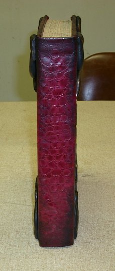
The finished product.

Ta-da!
Here are some more glamor shots of the finished item.

Aside from this book being a misprint, and having a small spot of paint on the edge of the pages from being stored. The only flaw in this book is that I lost a little of my square at the fore edge. Just a millimeter or so, and it's still usable, but it made the square a little off. I will adjust for this in future bindings.

P.S.- My renewed and continued thanks to Propnomicon for linking to Part One of this post. Since it doesn't have much to do with Cthulhu, I suppose it must have been a slow news day in Mythos land, but I am grateful for the traffic bump anyway.