Ha! I'm back! I have parted ways with the second job that kept me from my workshop, so at least until I find another day-job, I am back in the saddle.
The past few weeks have been spent preparing for a convention called
Con on the Cob. Over the past few years,
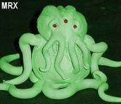
Rogue Chtulhu has been making a larger and larger presence there. This year, we took things up a notch, and that included several small builds from yours truly. Lets start things off with a look at my second attempt at a turn of the century style phonograph prop.
Some of you will remember my
Steampunk Phonograph that I posted about previously, which was made as a LARP prop for Origins. My second phonograph was made as decoration for a prohibition-era themed party at Con on the Cob, called the Friday Night Speak Easy. For the second version, I re-used the black and gold cardboard horn from the first phonograph prop, but a new body and plumbing were created. This version would look much more like an actual phonograph from the period, without the laser pointer stylus. I would, however, use similar plumbing pipe and fixtures for the brass-work, simply because it was easy and convenient (and I was under a time crunch).
I recently acquired a vintage victrola and a crap-ton of 78rpm disks from a friend who was moving cross country. So I decided to use the vintage disks instead of my poorly fabricated cylinders from version 1. That meant a new body, so that's where we start. The new body was made from some scraps of 3/8in. plywood, some 1/4in. luan paneling, and some molding strips.
Here you can see the basic box shape being glued together. The sides are 3/8in. plywood scraps that were left over from my last
lighting rig expansion. The top is a scrap piece of 1/4in. Luan paneling.
Because I only used glue, and no nails or staples, I put some reinforcing strips of molding (some may have been thin scraps of plywood) on the interior side to give it more strength and stability. The bottom of the basic box was left open.
In order to hide the cut edge of the plywood, and to give some more shape to the box, and make it look a little more authentic, I added some strips of molding. Around the bottom edge, I added quarter round, and along the seams and around the top I used some flat molding (I don't remember what it's called). Unlike the plywood sides, the molding was mitered for a nice clean seam. These were also glued and clamped. No nails or staples were used.
The next step was to center a disk on the top and find out where to put the spindle pin. Because there is no motor, the pin could be just a piece of metal of the appropriate diameter sticking up through the luan top. I searched through my dad's old bolt bins for the right size machine bolt, cut it off with an angle grinder and rounded out the cut tip. After some polishing, it made a fairly convincing spindle. Since it is just a set piece, there isn't even a platen. I just stack two 78s on top of each other to give the illusion of height.
I had already sanded the box thoroughly before adding the molding, so next up was staining and poly. I used red mahogany stain and gloss polyurethane. The difference in base color between the plywood and the luan creates a slight contrast. Also, some of the trim molding was previously stained from another project, so that creates a little contrast too.
With the stain and clear coat dry, the last thing to do was to mount the old horn. I would need some new pipe-work, a stylus, a bracket, and maybe something ornamental.
I looked for a little while to find something to use as a bracket to hold the horn assembly up. I finally settled on a bit of brass scroll work that came from a decorative sconce. It is a little weak for the weight it must hold up, but it looks nice, and though it sags a little with everything assembled, it is holding up so far.
While I was looking through my parts bin for brass bits, I found a nice brass lion head drawer pull that provided just the right amount of ornamentation for the front panel.
The pipe-work was made from actual copper pipe and pvc painted to look like copper. Trying to match painted copper to real copper is a huge pain in the ass. Especially since copper can vary so widely in hue depending on its state of oxidation. Also, unless you put some clear coat on it, your copper will darken, but your painted pieces will remain the same over time. The selection of pipe pieces was largely dictated by what I had on hand and what would fit together with the least amount of modification.
As for the stylus, I got lucky and found a part form my junk bins that was about the right shape and fit into the pipe end perfectly. It's a cheap tire pressure gauge. I took off the stickers, popped off the glass, ripped off the dial pointer and flipped the dial face backwards so it appears to be blank silver. I put the glass back in place and removed the tip so it would fit better into the diameter of pipe I had chosen.
The final touch was the needle itself. I looked around for a while to find something that was the right size and shape but would cause the least risk if damage to the 78 disks that it would be sitting on. I settled on a pop rivet. I just drilled a hole in the appropriate spot on the tire gauge and stuffed the pop rivet in the hole. I didn't use a rivet tool, or even glue. I did, however, trim the length of the pop rivet by about half, subsequent to these photos being taken.
Next I had to paint the pvc parts of the pipe-work and once dry, everything is just dry fitted for final assembly. Only in a couple of places did I use any glue. It can mostly be disassembled.
And that's it! I know it's only an approximation of an actual phonograph, but it was a hastily made set piece that would only be seen in the dark and not used or handled. Still, I like it better than the first version. Below are some pictures of it in situ at the Friday Night Speak Easy at Con on the Cob.
I hope you all enjoy this fun little prop. I have a few other small builds from the Con on the Cob show, that I will be posting soon, and who knows, depending on how soon a find another day-job, I may have some more good stuff on the way.